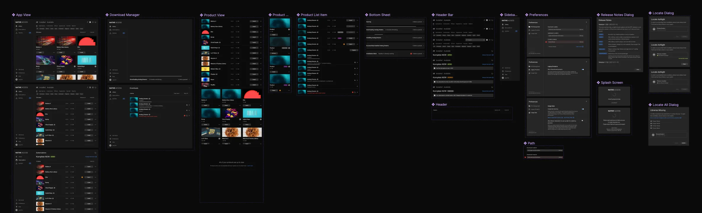
Elements
- Sidebar
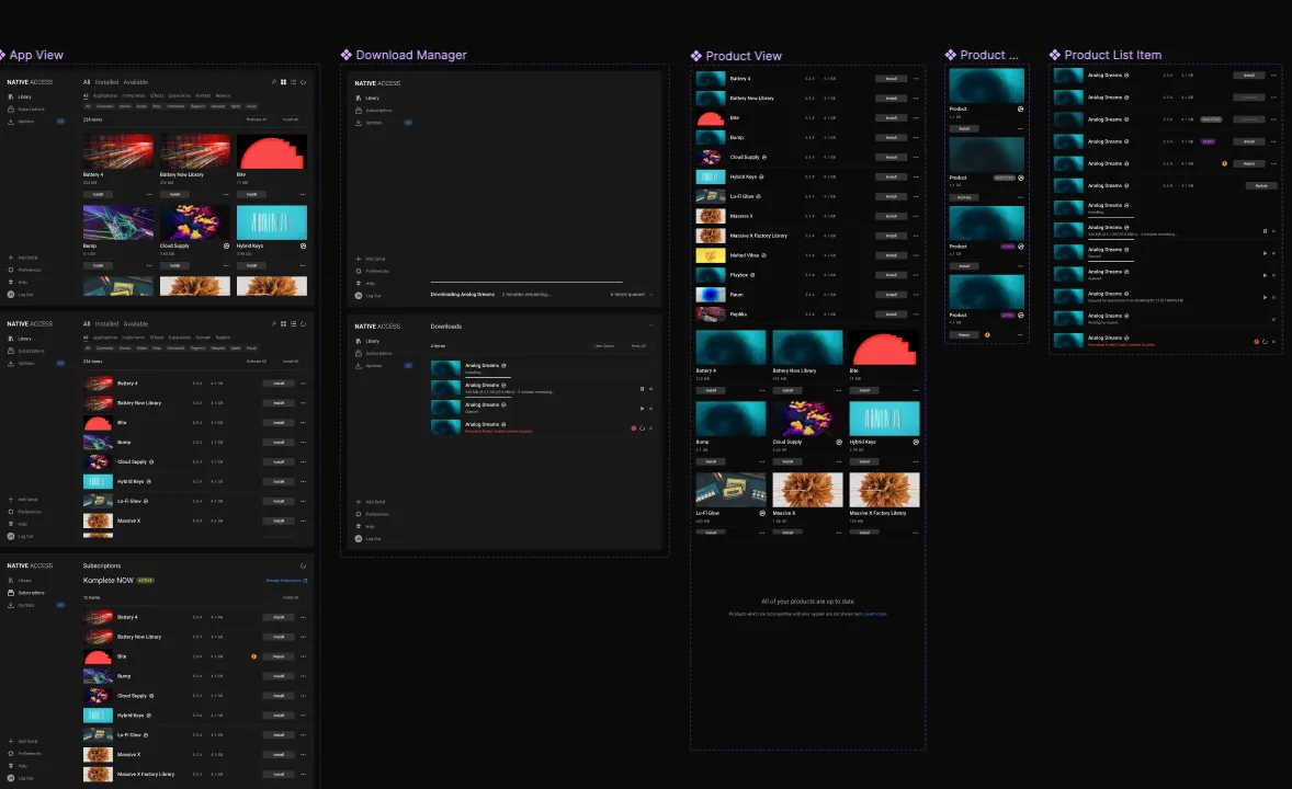
- Content Area
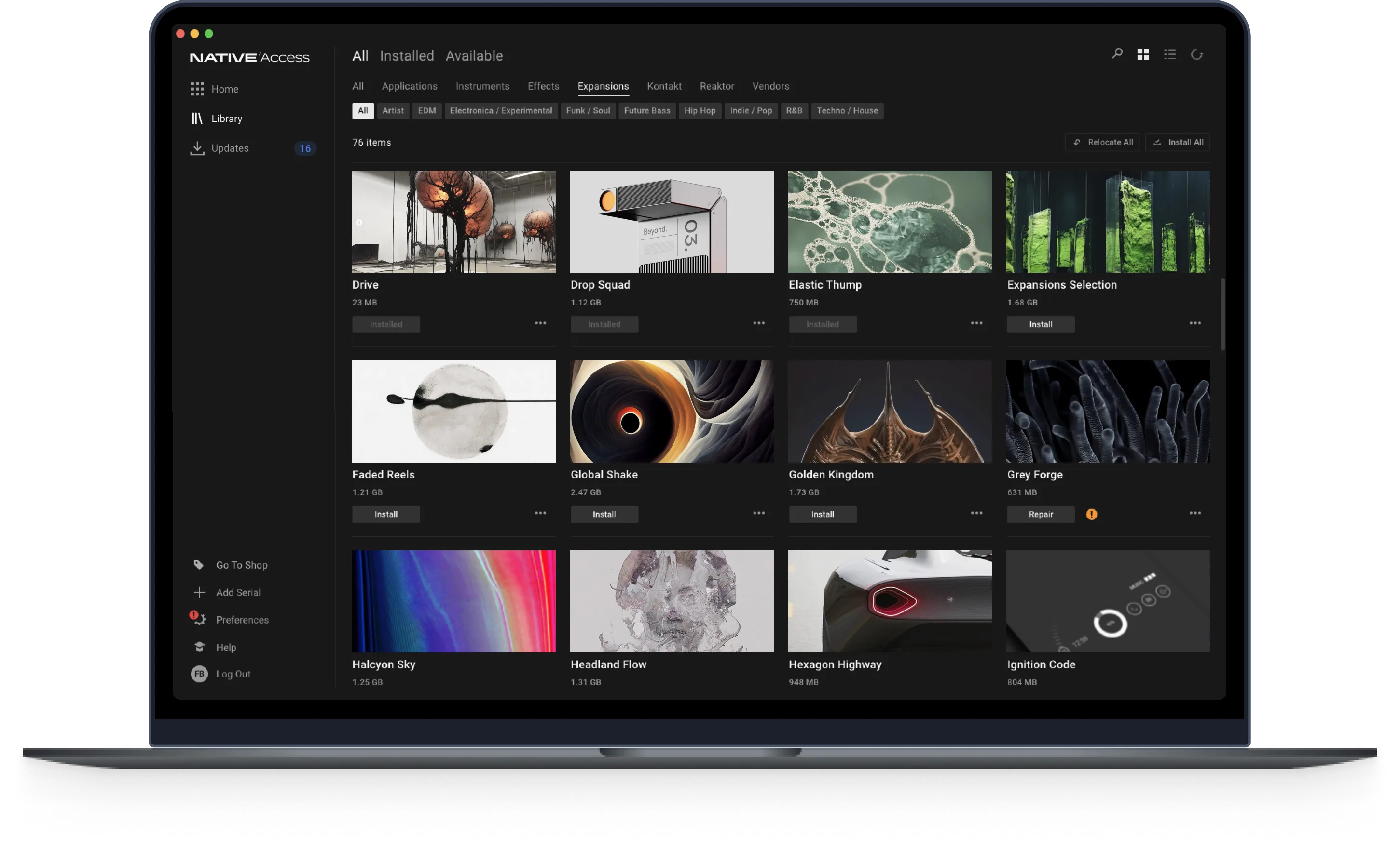
- Tiles / List
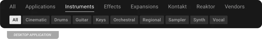
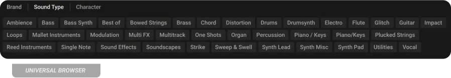
- Filters
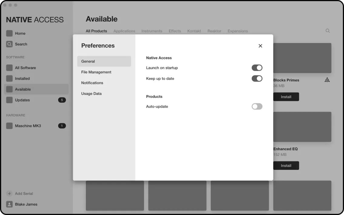
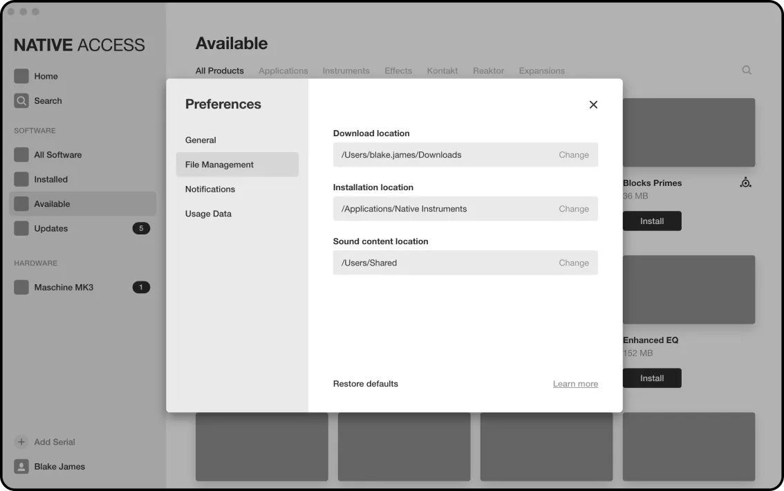
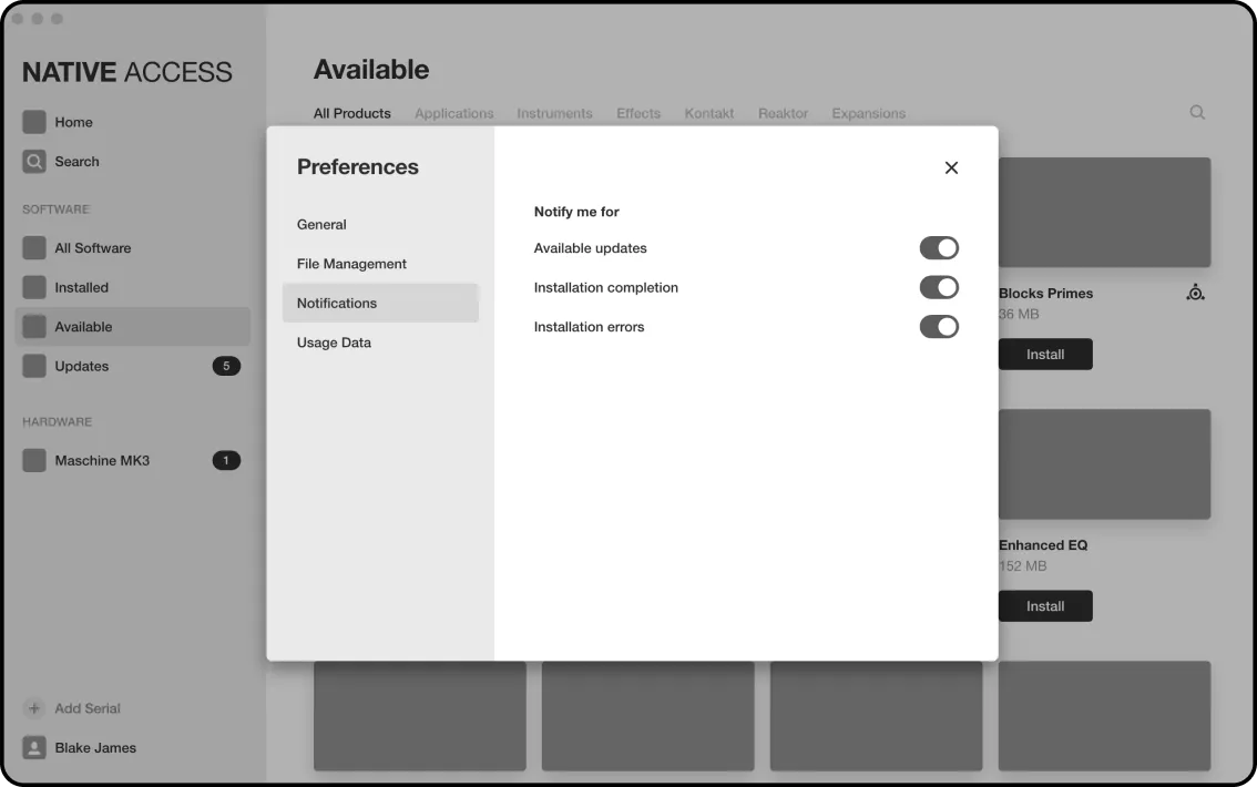
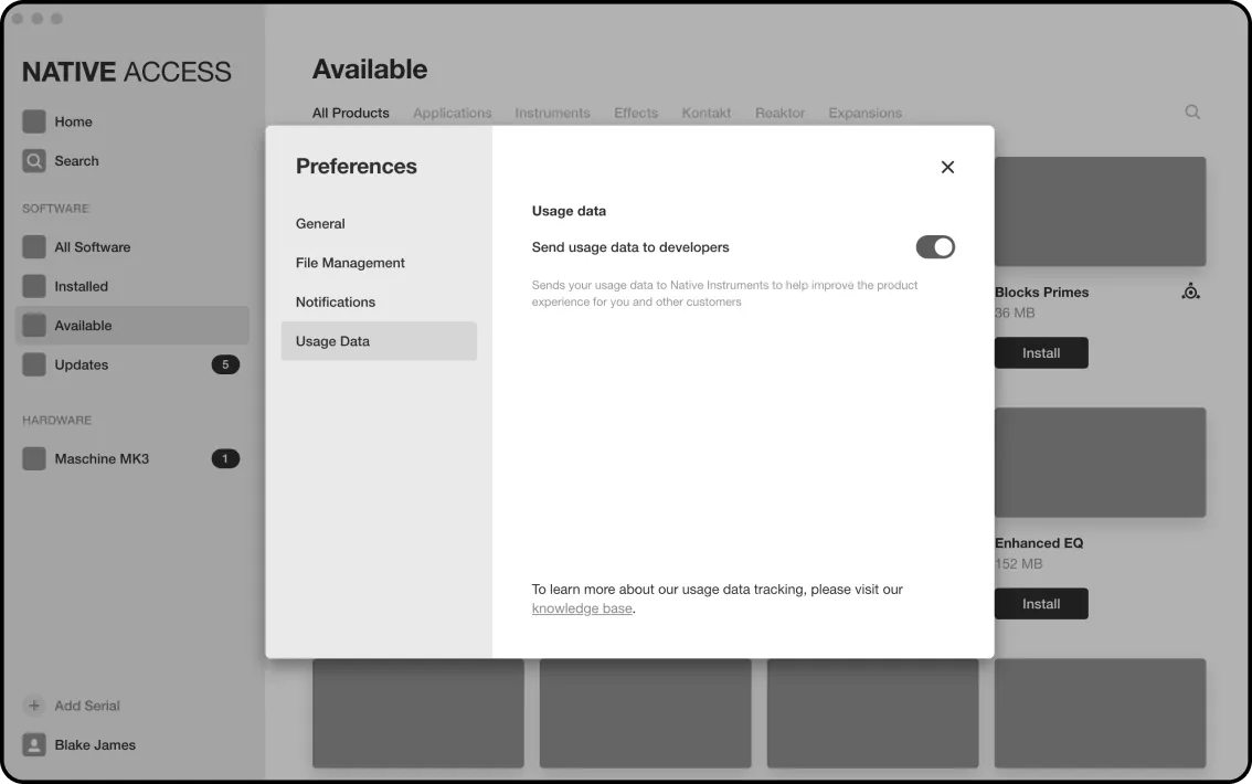
- Preferences
- Dialogs
- Product Detail Page
- Search
- Download Manager
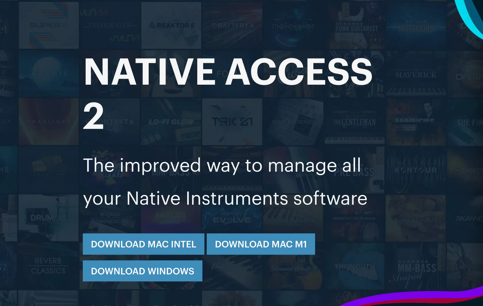
Design and build a product portal allowing users to download and install products the users own, and explore new products.
Native Instruments
UX [Design Lead]
Entity Maps
Wireframes
Prototypes
User Tests
UI
In-app Feedback
Alpha / Beta Community
B2B Design SDK
Spec Writing
Native Instruments offers a catalog of over 200 products with many different Bundle offerings. Additionally, NI is an eco-system company which provides the frameworks for other virtual instruments companies to build their products. In order to compliment this we wanted to offer download-portal-as-a-service to third party companies. Finally, there was an incoming company rebrand. A revamp of the download portal was overdue.
I embarked on this project with a list of refined pain points from Customer Support and a cry from our new Director of Web & Services; to rebuild the age-old download portal in order to engage users more and funnel users to the webshop. Planted with seemingly impossible challenges, this project required skill beyond my usual UX role. Both the tooling and the requirement of subscription demanded cross-team and cross-department communication. I created an interactive visual Source of Truth to keep the xfn gears churning. Read on for the full story and help yourself to Figma files down below!.
Increased Monthly Active Users** by 300%
Resolved** 8 of the top 20 company pain points [across all teams and products]
Reduced average setup time by 40%
Increased the success rate of initial application launch from 69% of users to 89%
Decreased setup-related support tickets by 45%
Today, 7.5% of attributed revenue comes from Native Access’s touchpoint
I designed solutions to put in front of users. On my plate were pre-existing pain points #, feature parity, and the Director’s new requirements to increase traffic to webstore .
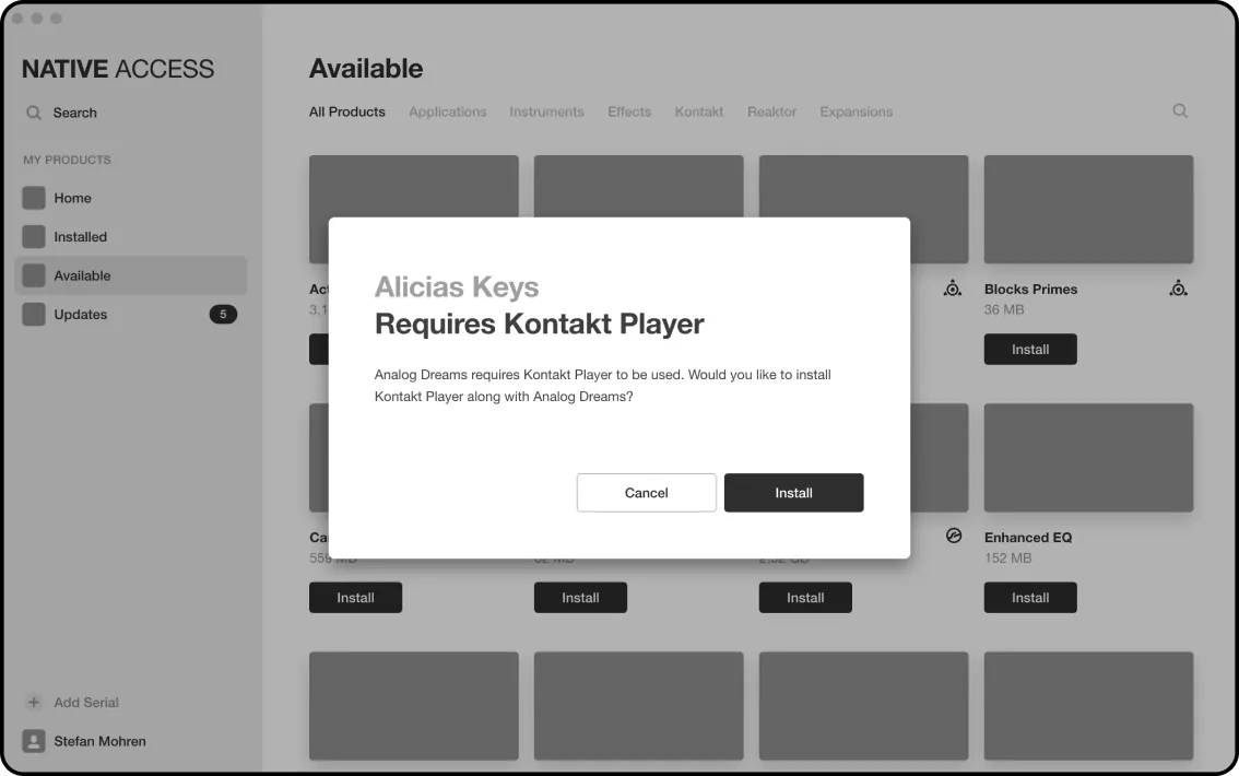
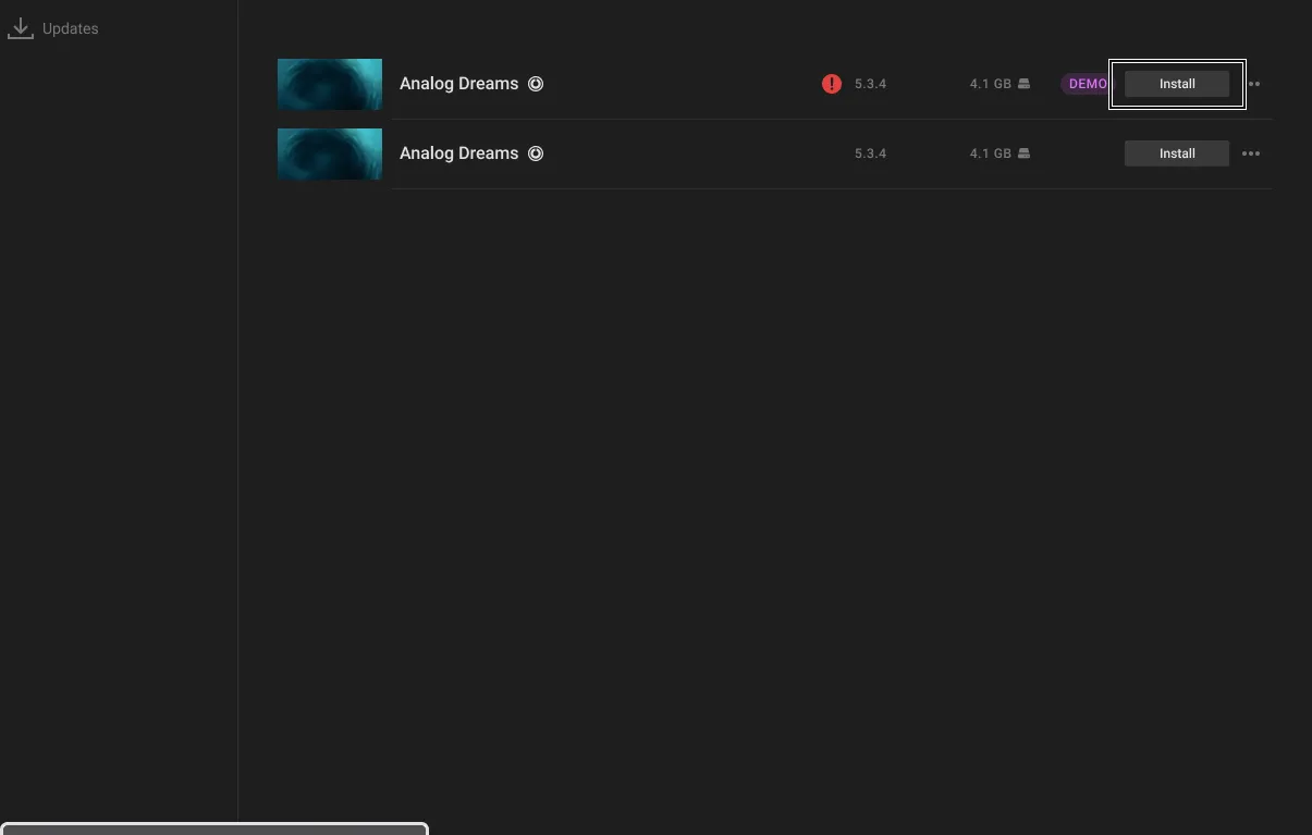
“I don’t understand product dependencies like KONTAKT Player and REAKTOR Player.”
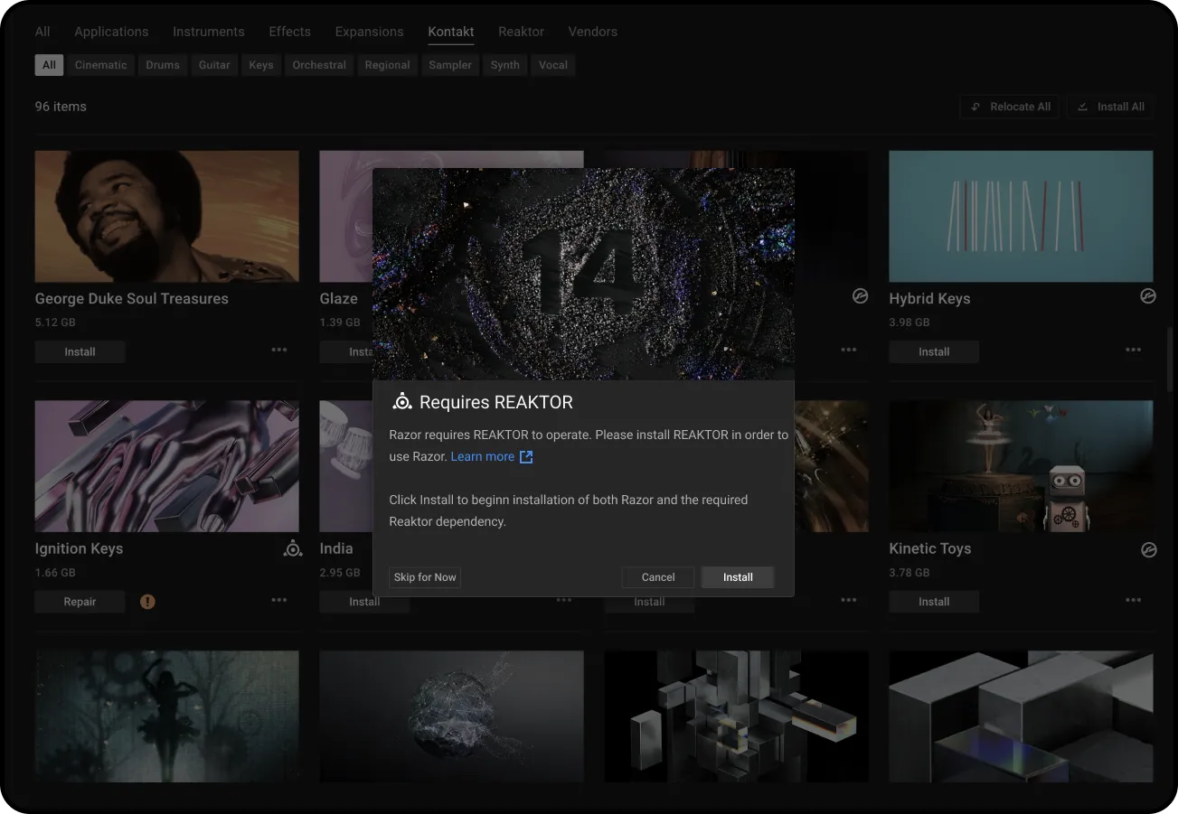
Icon indicating dependency
Detect if the user is attempting to install a
product which requires a framework
“I don’t understand my KOMPLETE bundle and its products.”

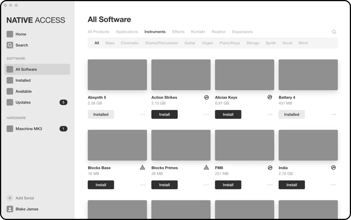
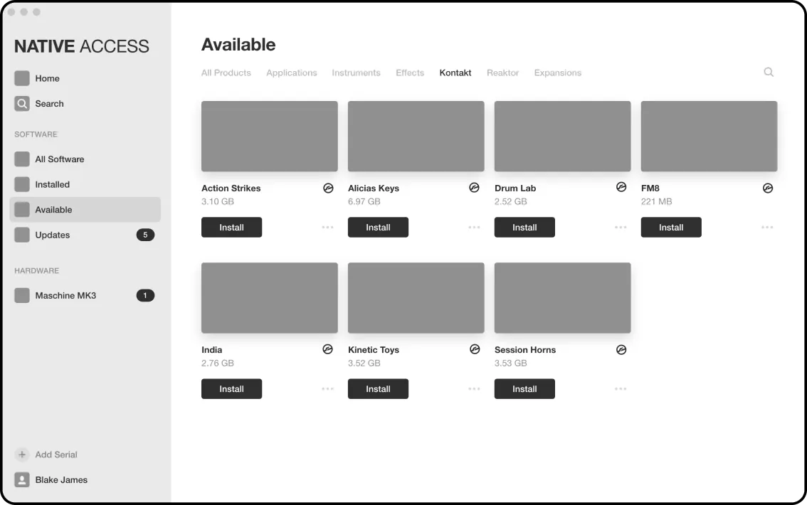
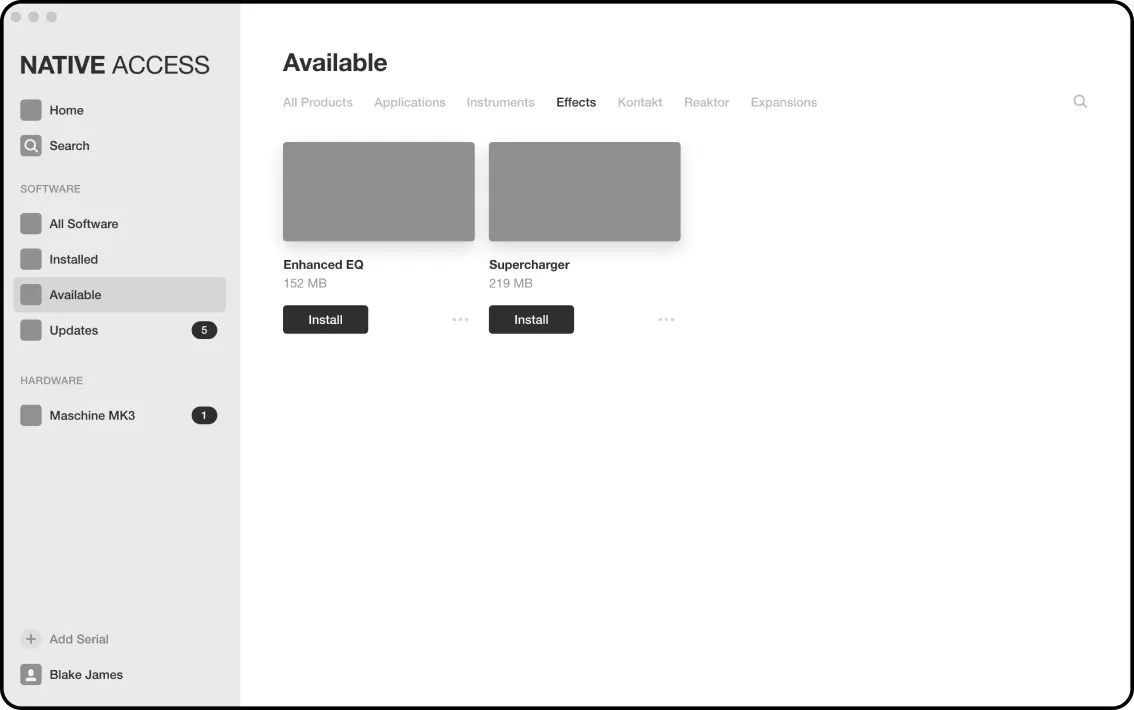
Aligned metadata for searching across web, download client, and browser application

Similarly, we aligned category metadata across platforms
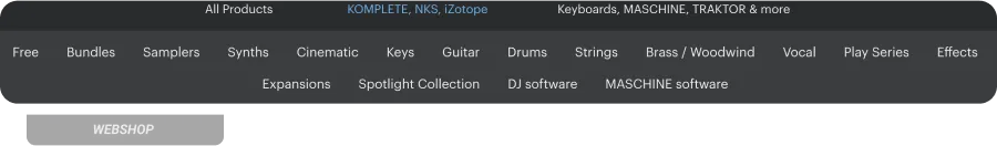
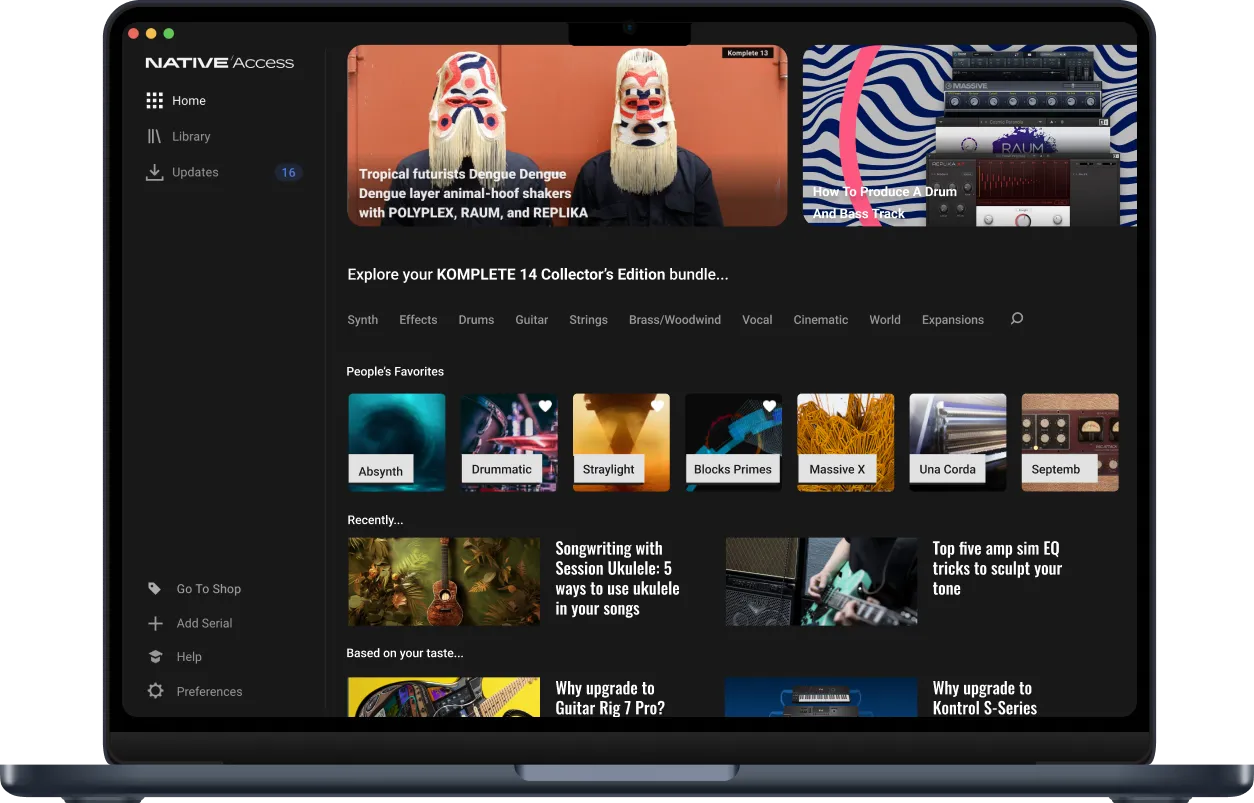
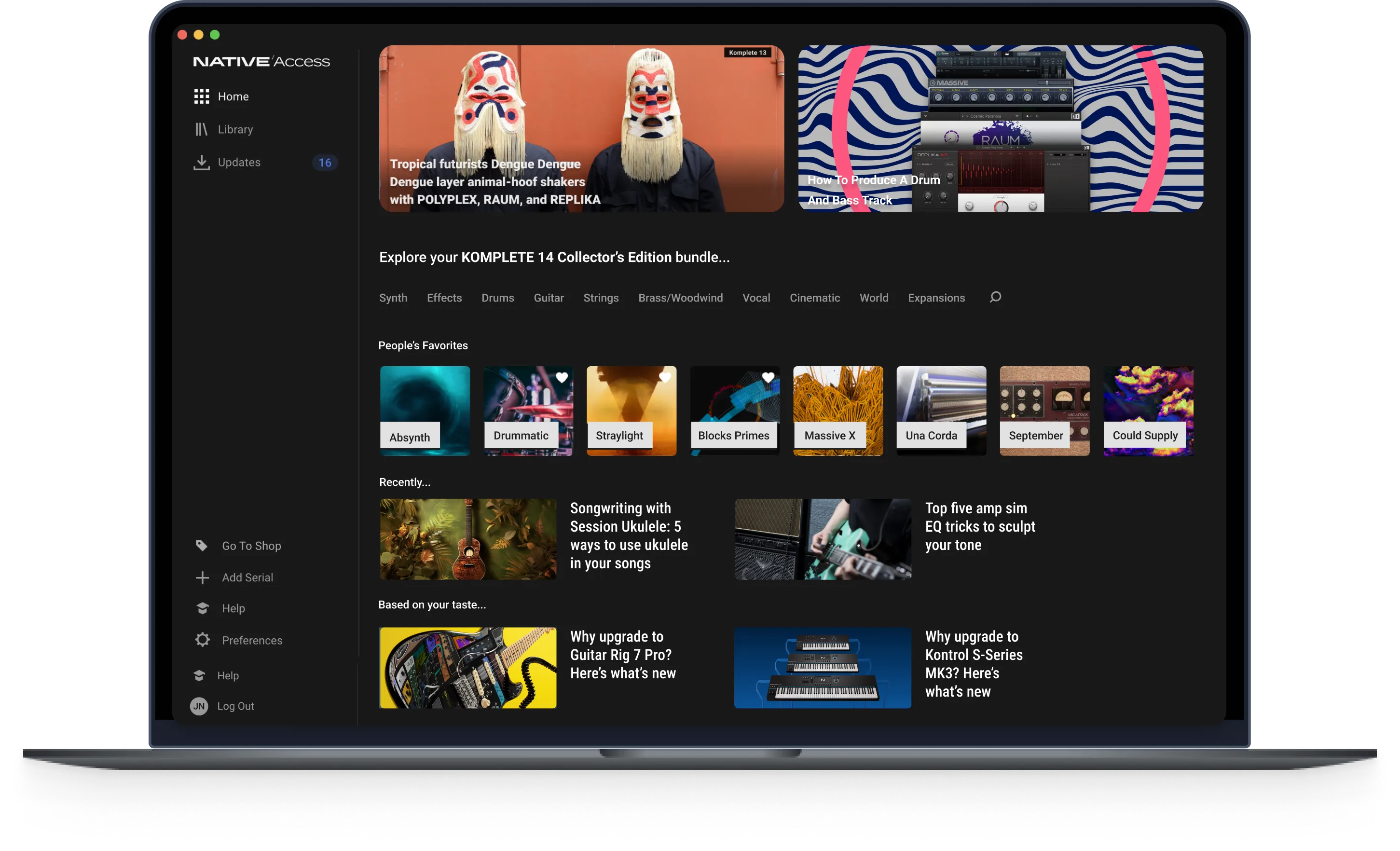
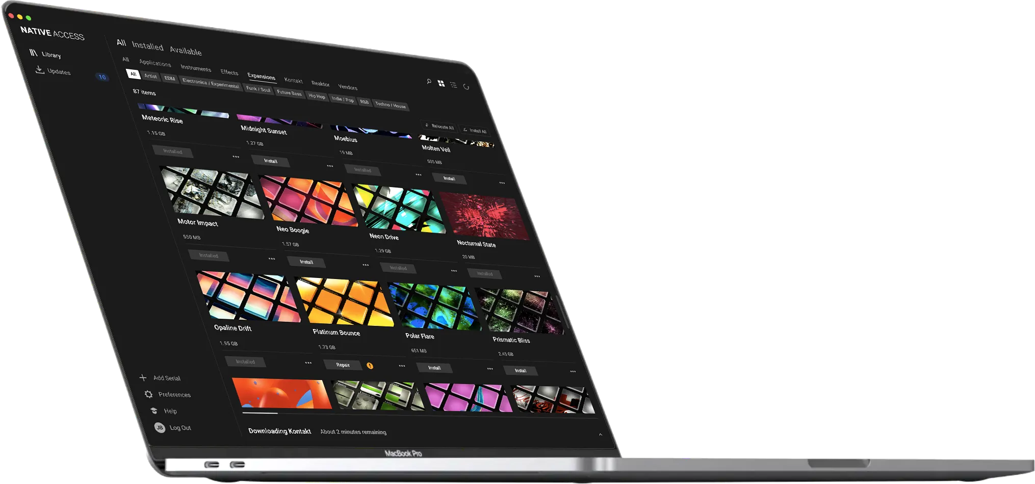
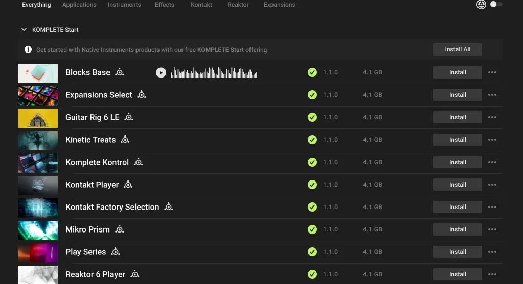
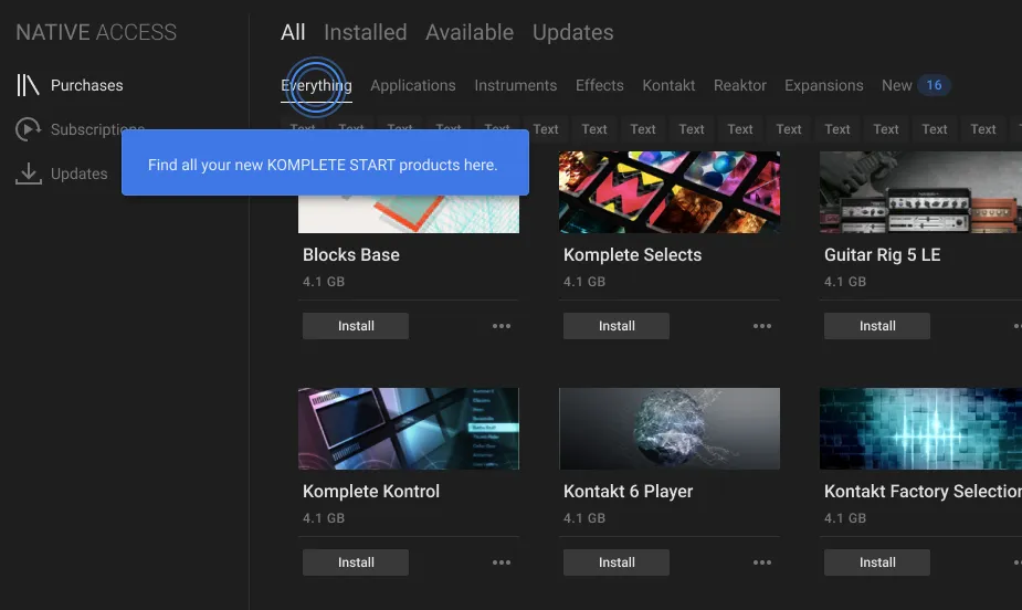
Exploration page with swim lanes containing intelligent suggestions
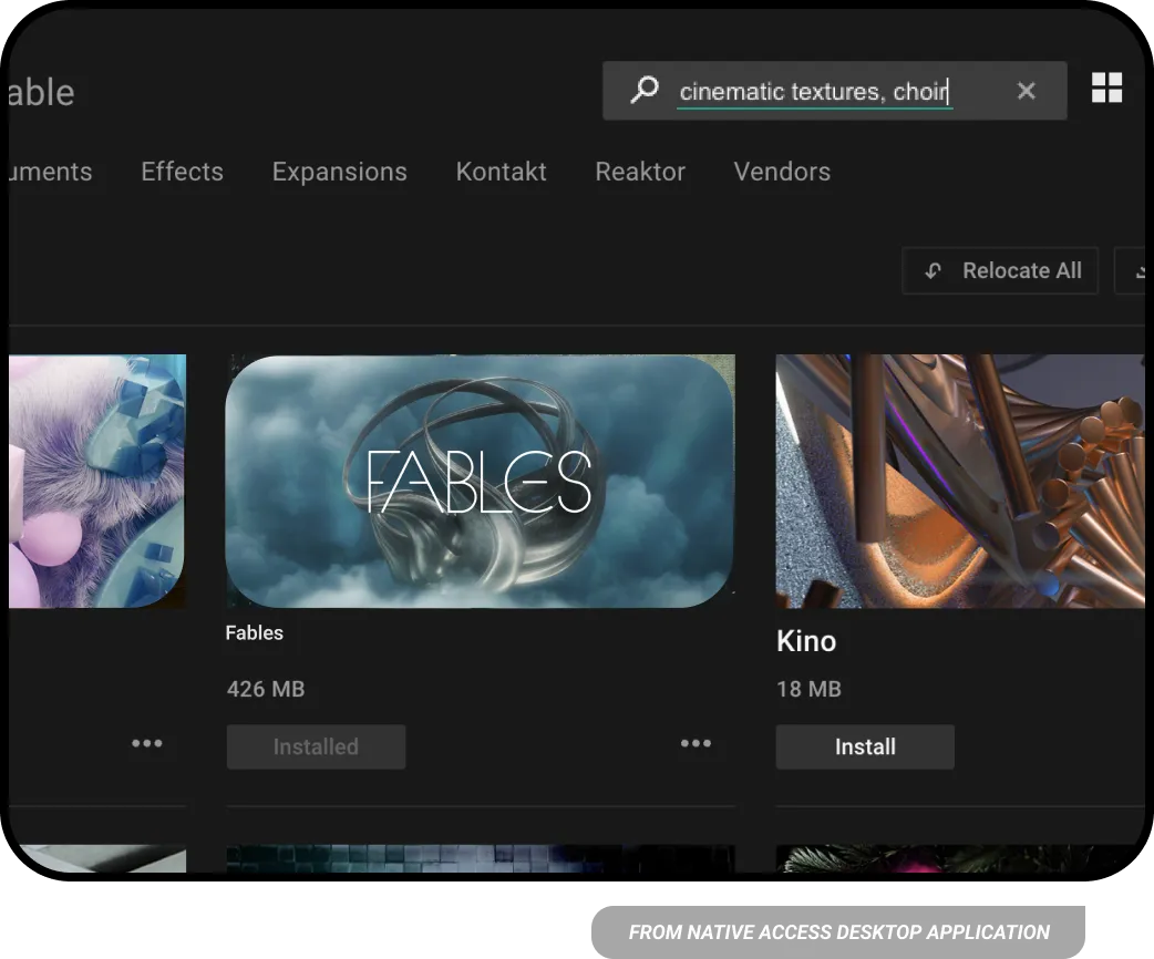
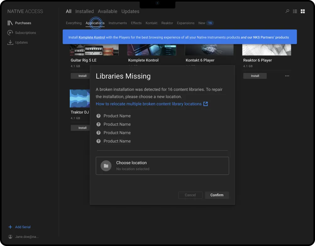
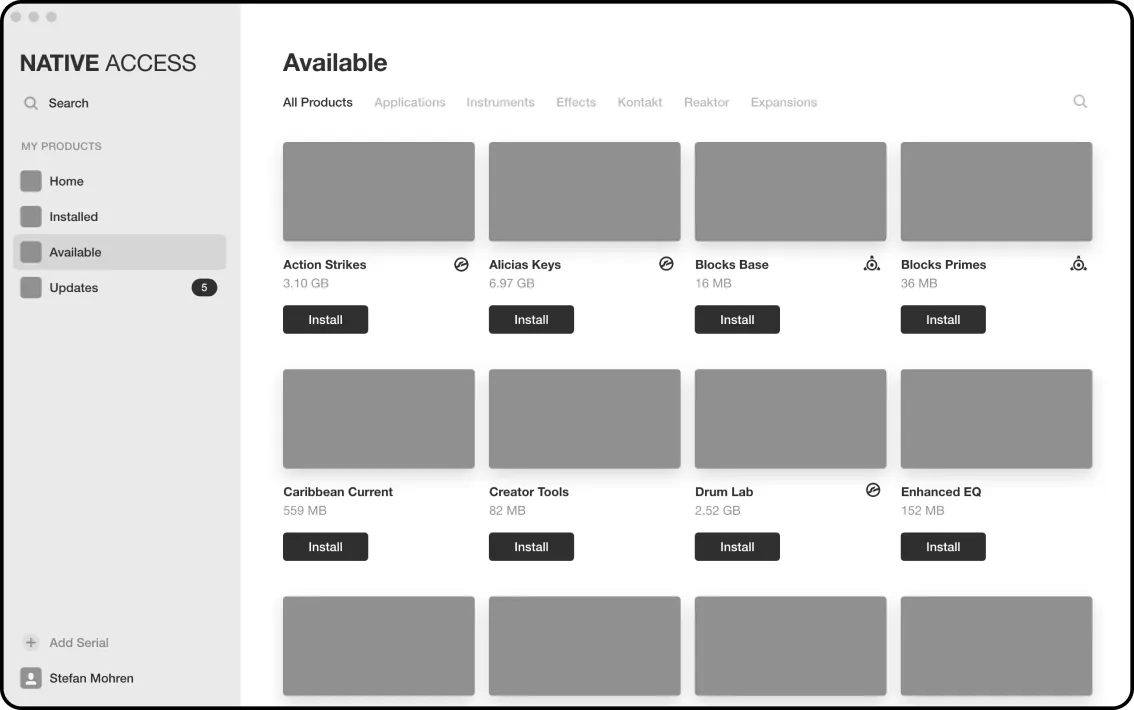
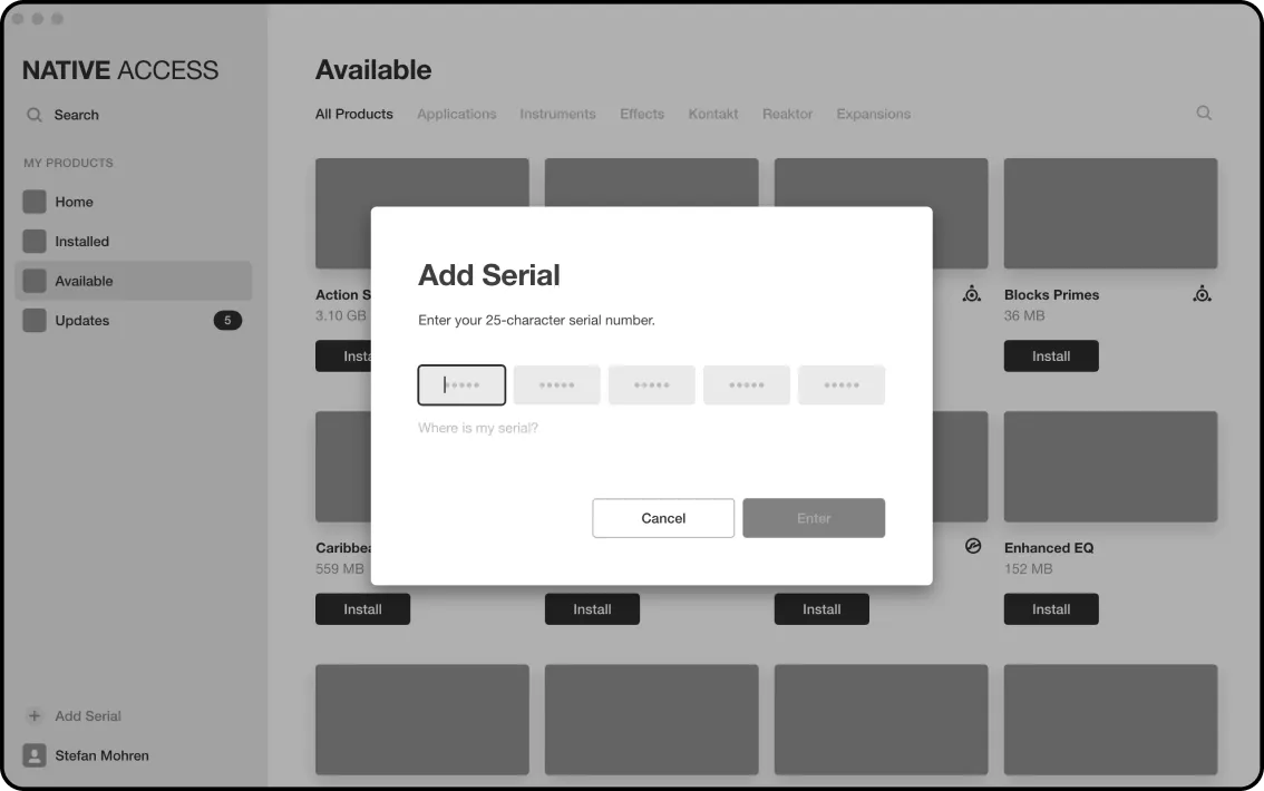
“Installation of third-party products is confusing...”
Onboarding
Workflow for locating missing products
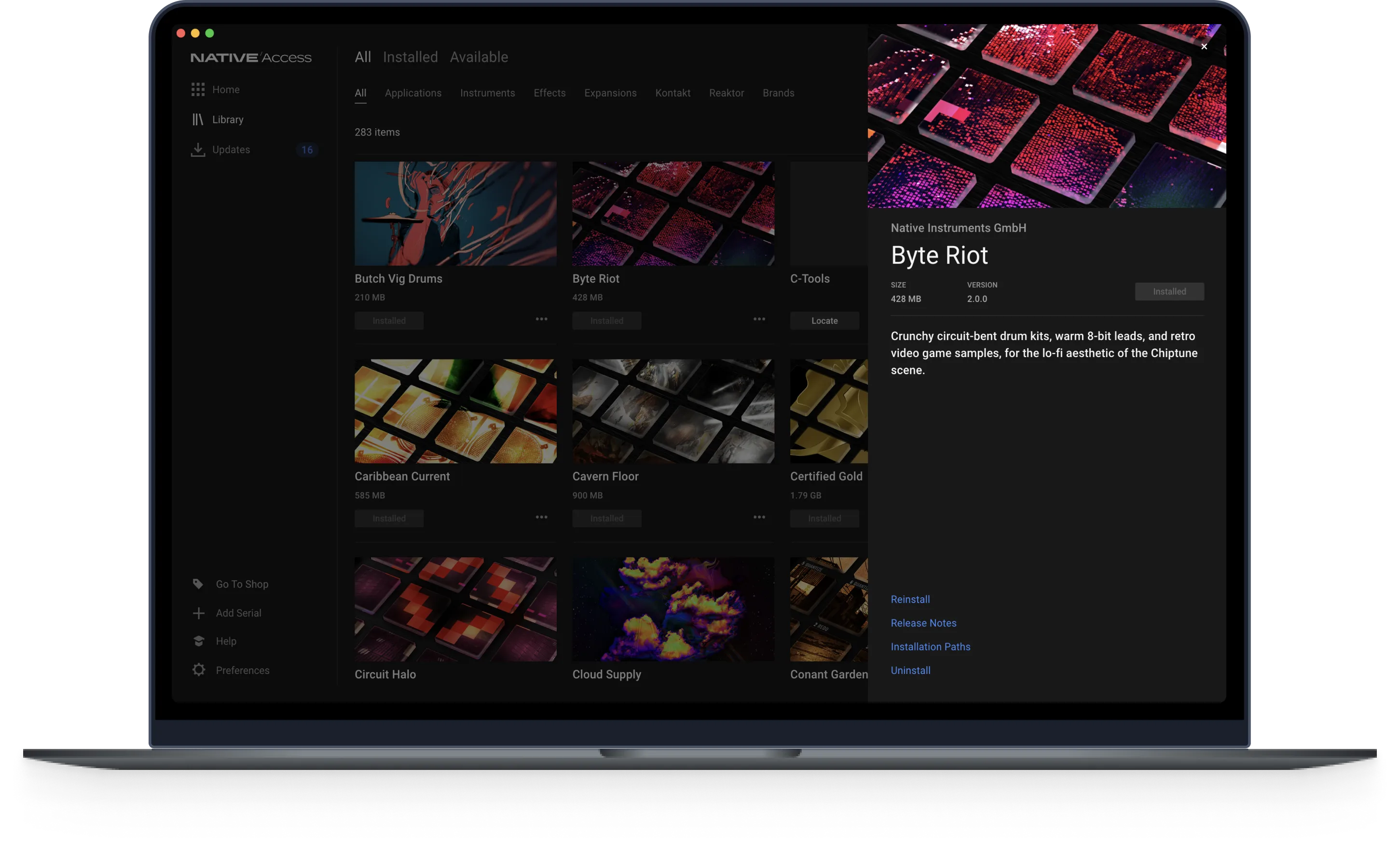
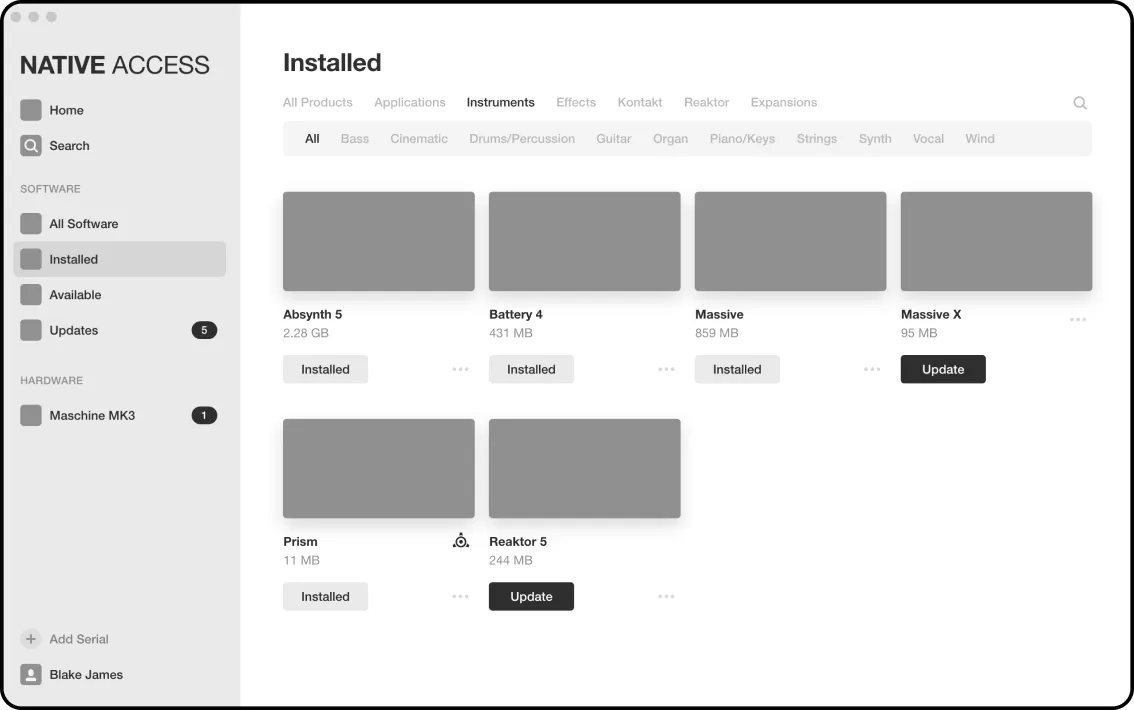
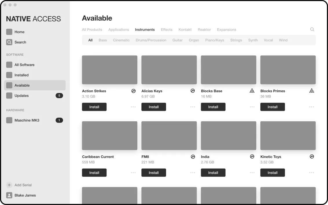
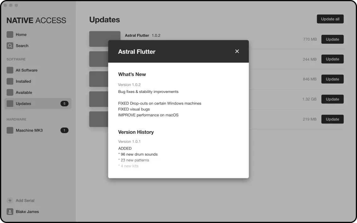
“I want more info on the products I own.”
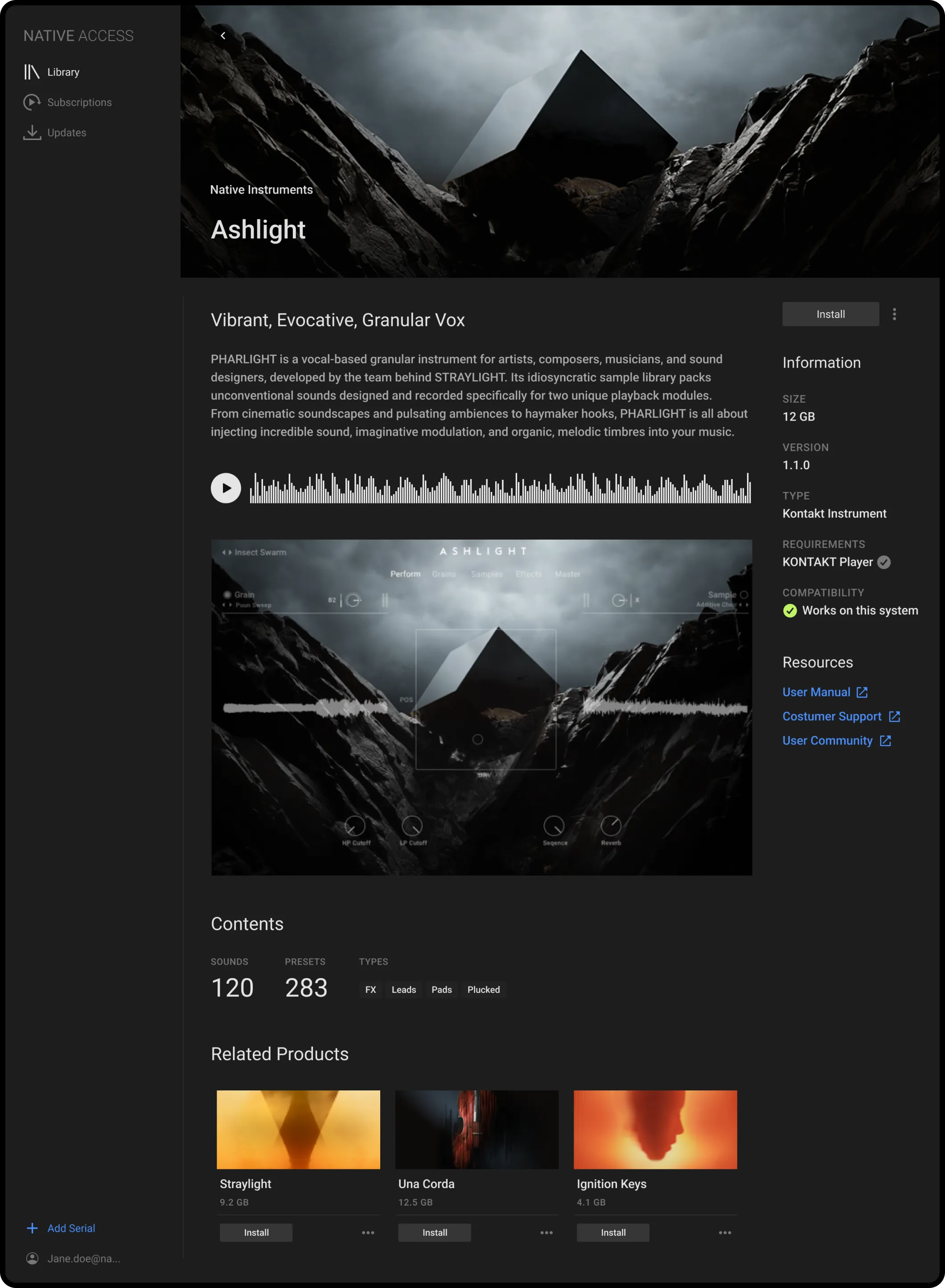
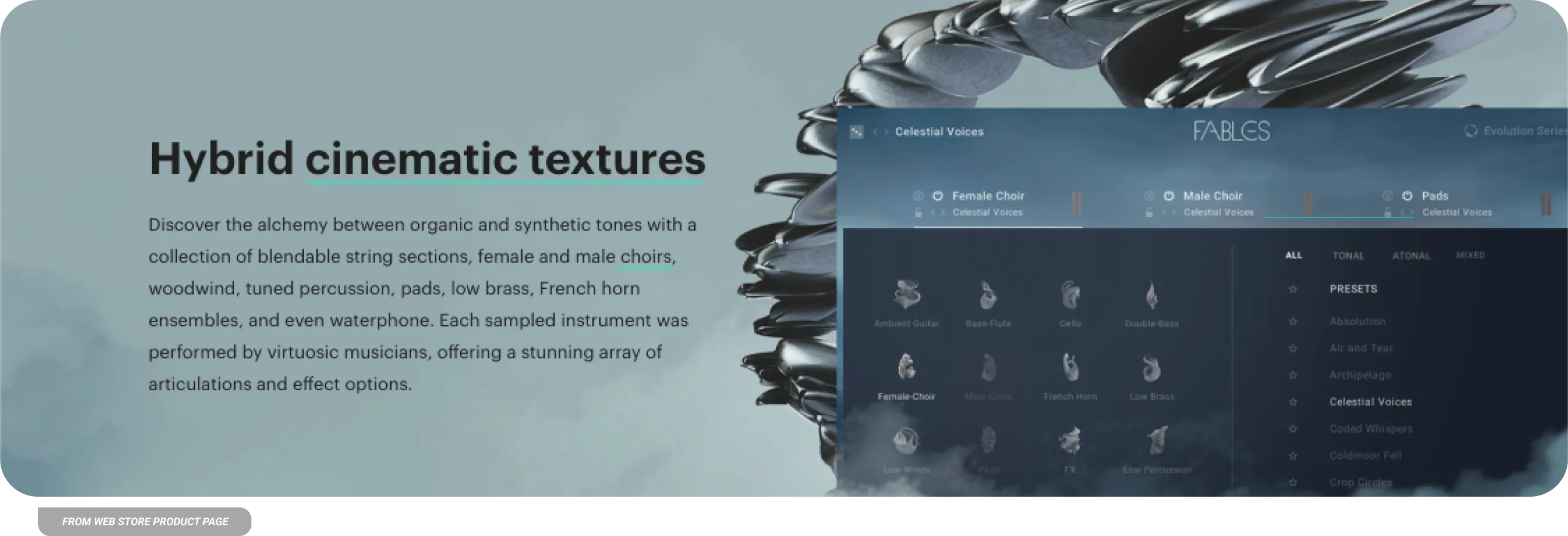
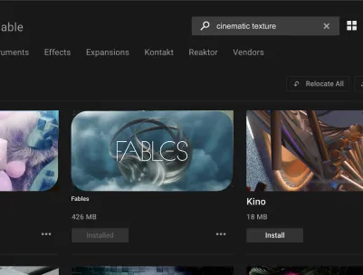
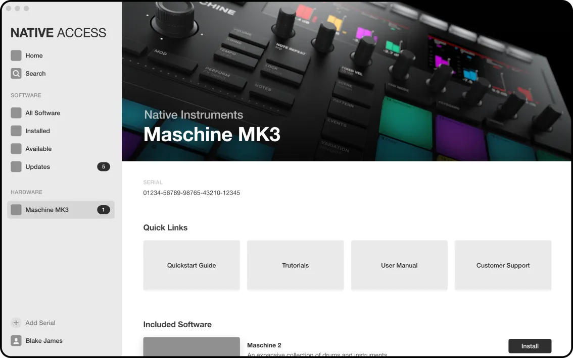
A Product Detail page with...
Audio Previews
GUI Screenshots
Resources
Related Products
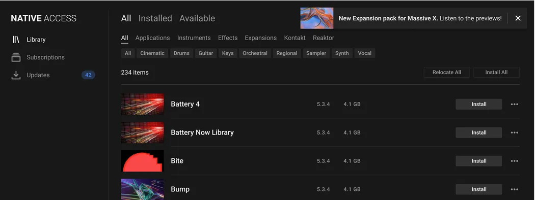
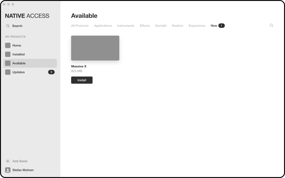
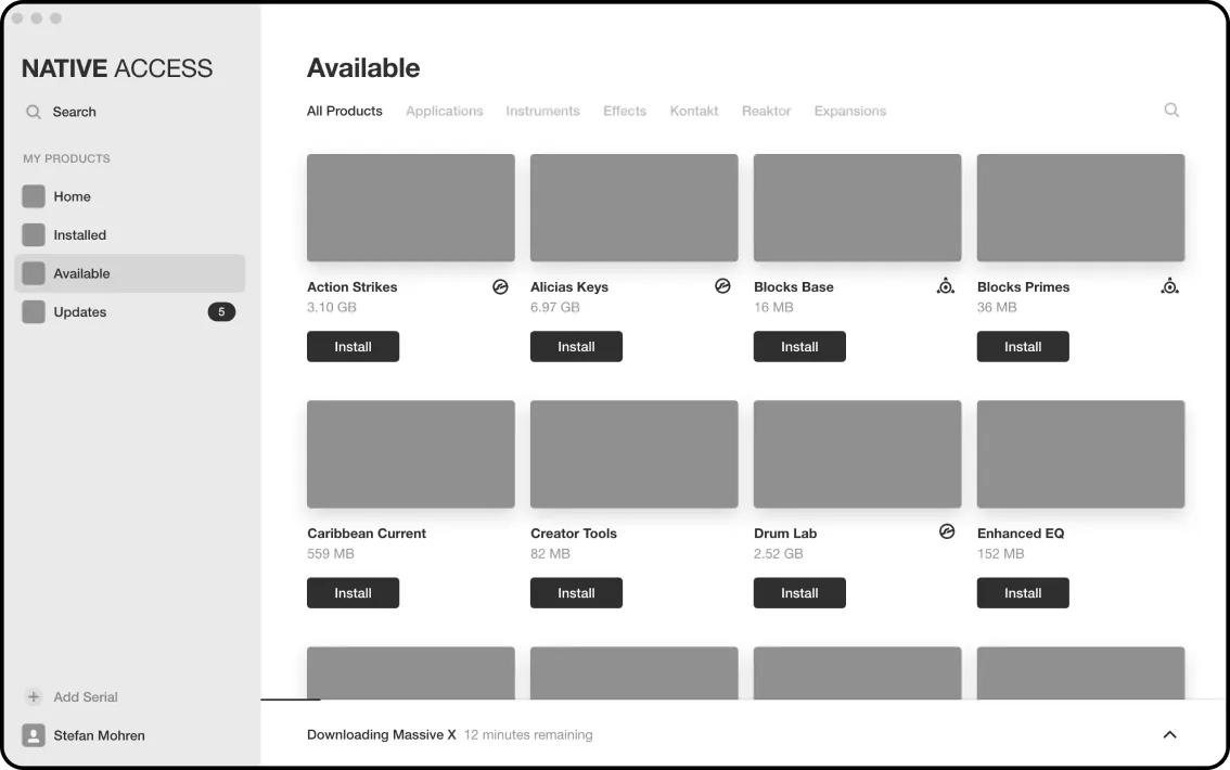
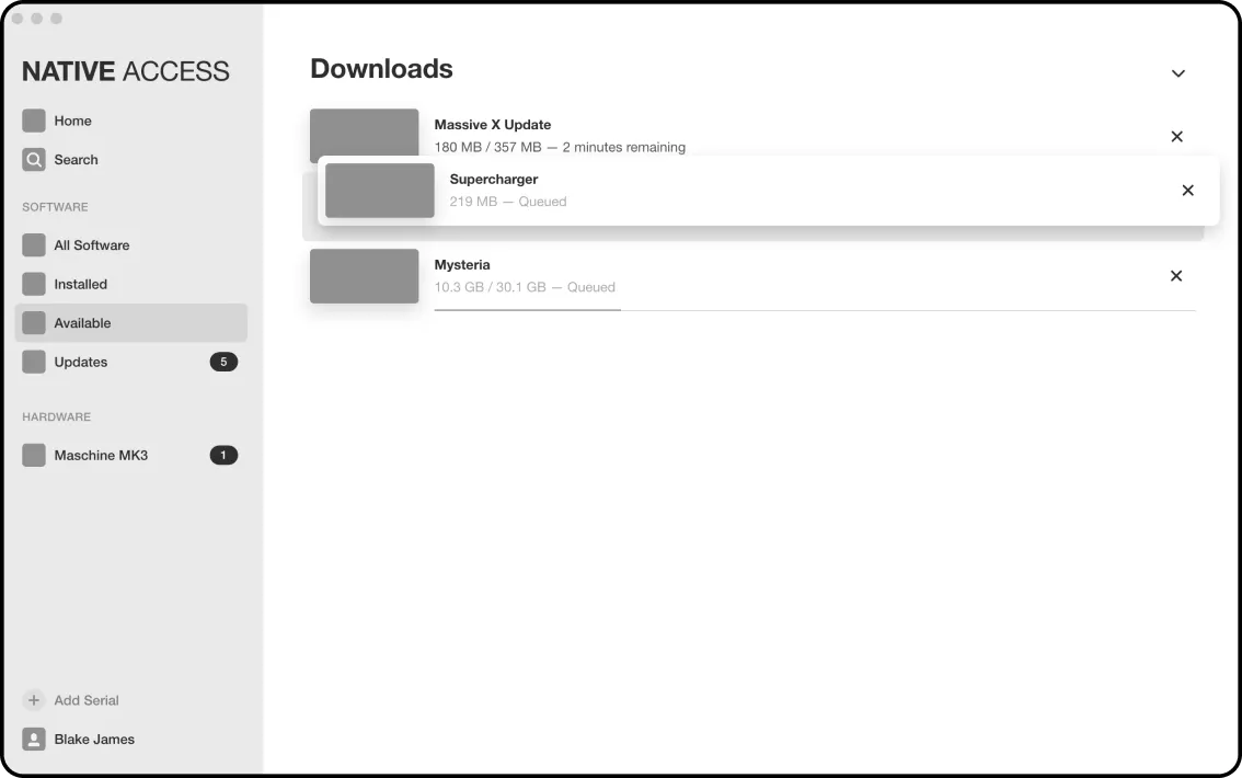
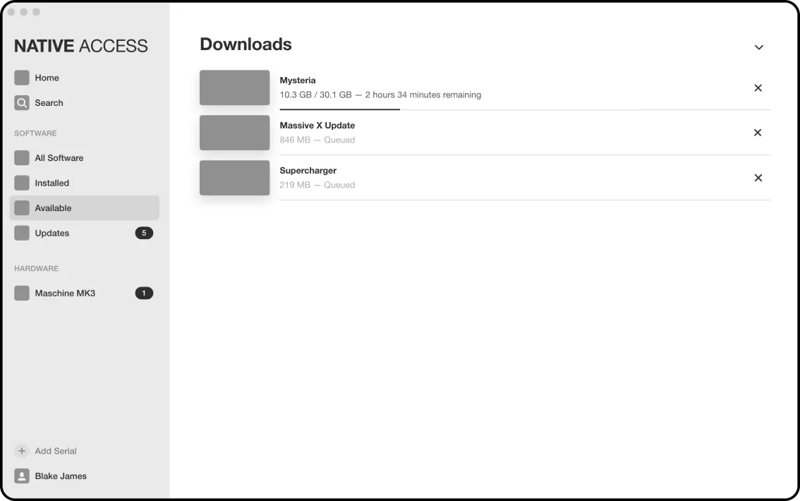
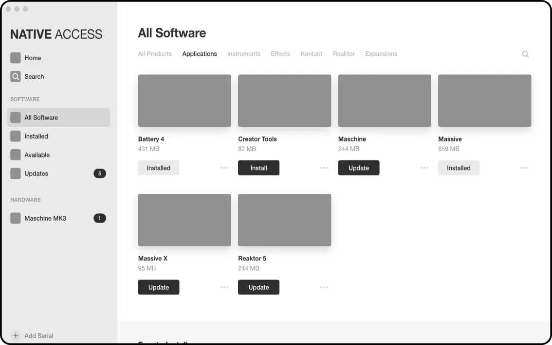
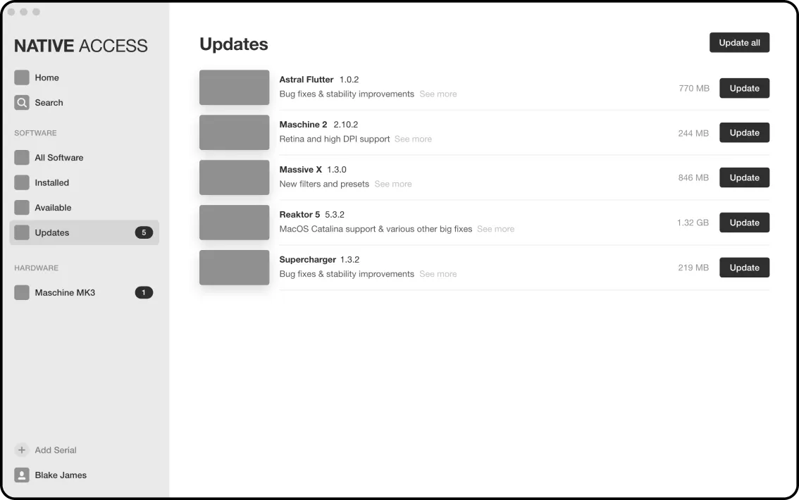
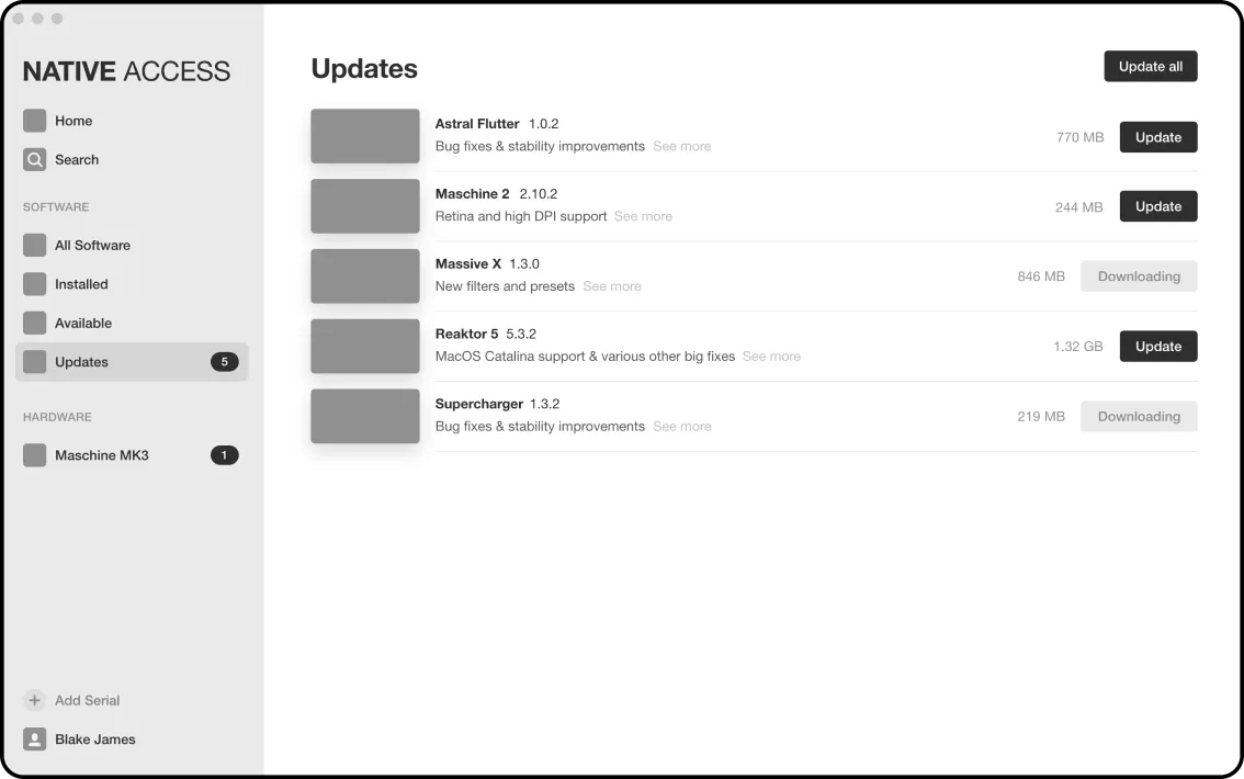
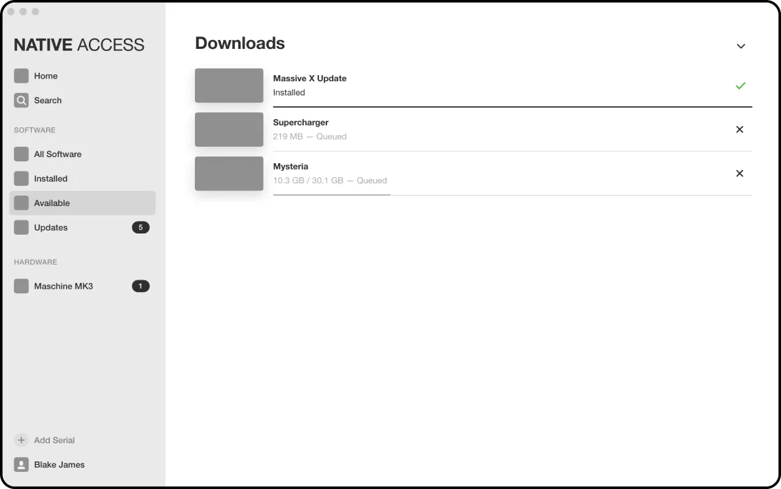
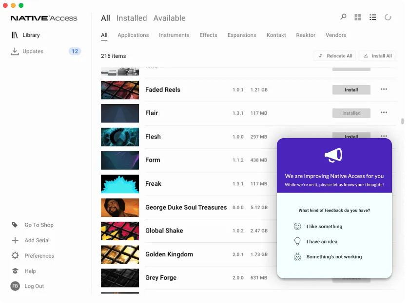
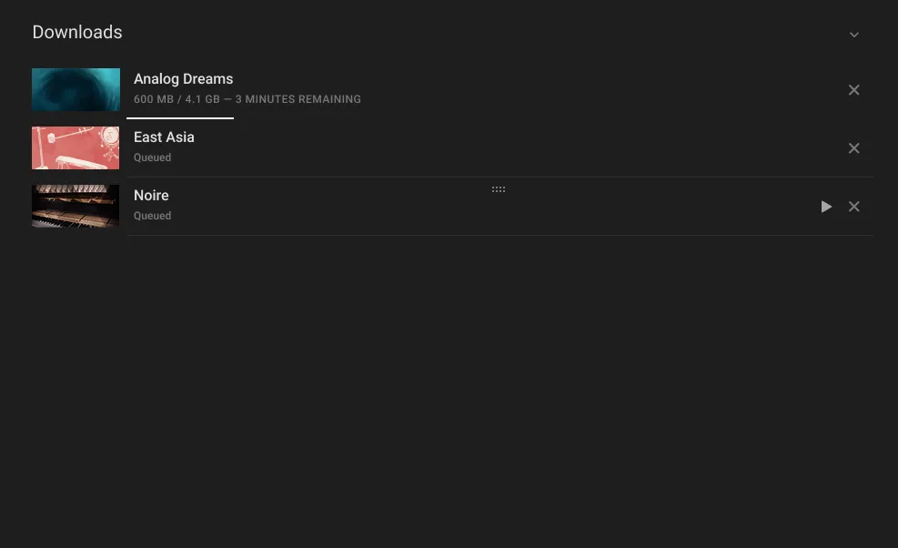
“No overview or progress of downloads”
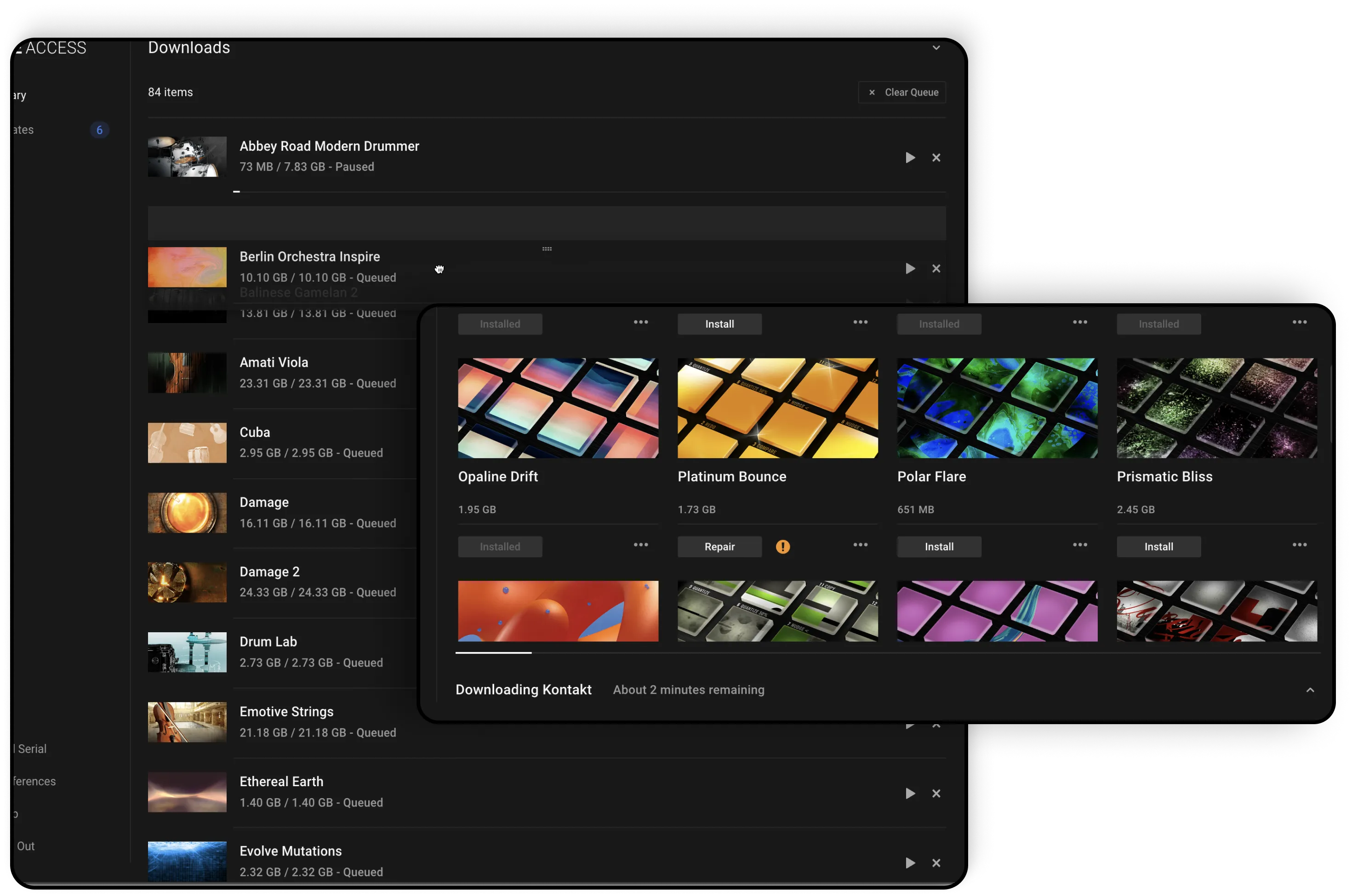
Download Manager
Download progress drawer in main app
Ability to sort hundreds of download items
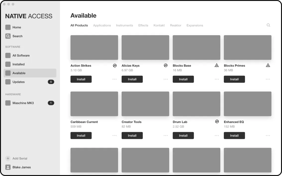
“I want to funnel users from the download portal to the online store.”
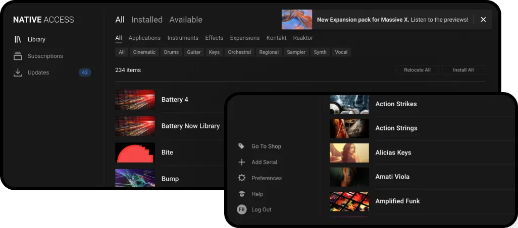
Upsell notifications for new releases and suggested content
Go To Shop link
Exploration Page [shown above]
The solutions were received very well.
For each feature...
8+ out of 10 responded they “would use.”
7+ out of 10 responded they “love it.”
The designs were then broken into Epics and Stories and arranged by priority in the backlog.
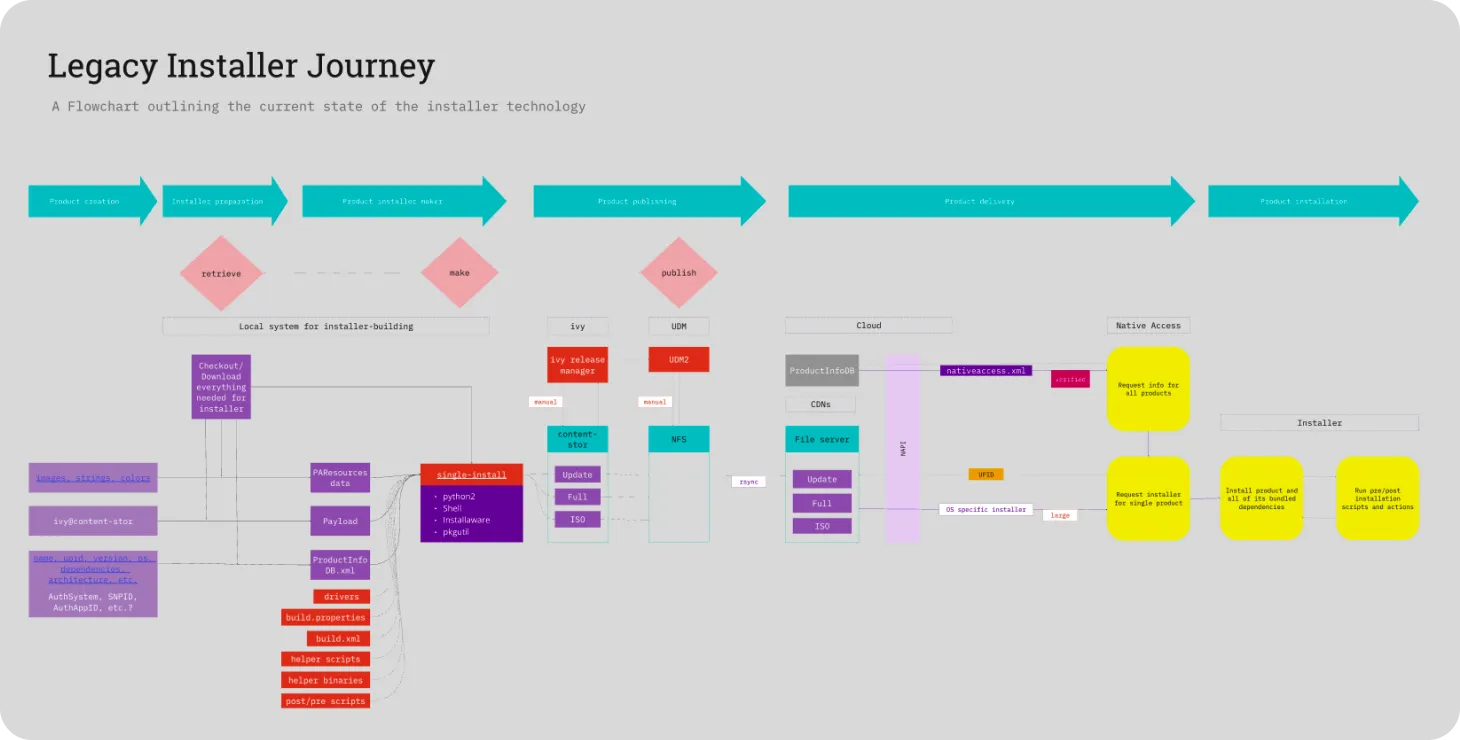
Native Access is the client all Native Instruments products depend on. This proved to be one the most challenging projects in my design career. Here’s why...
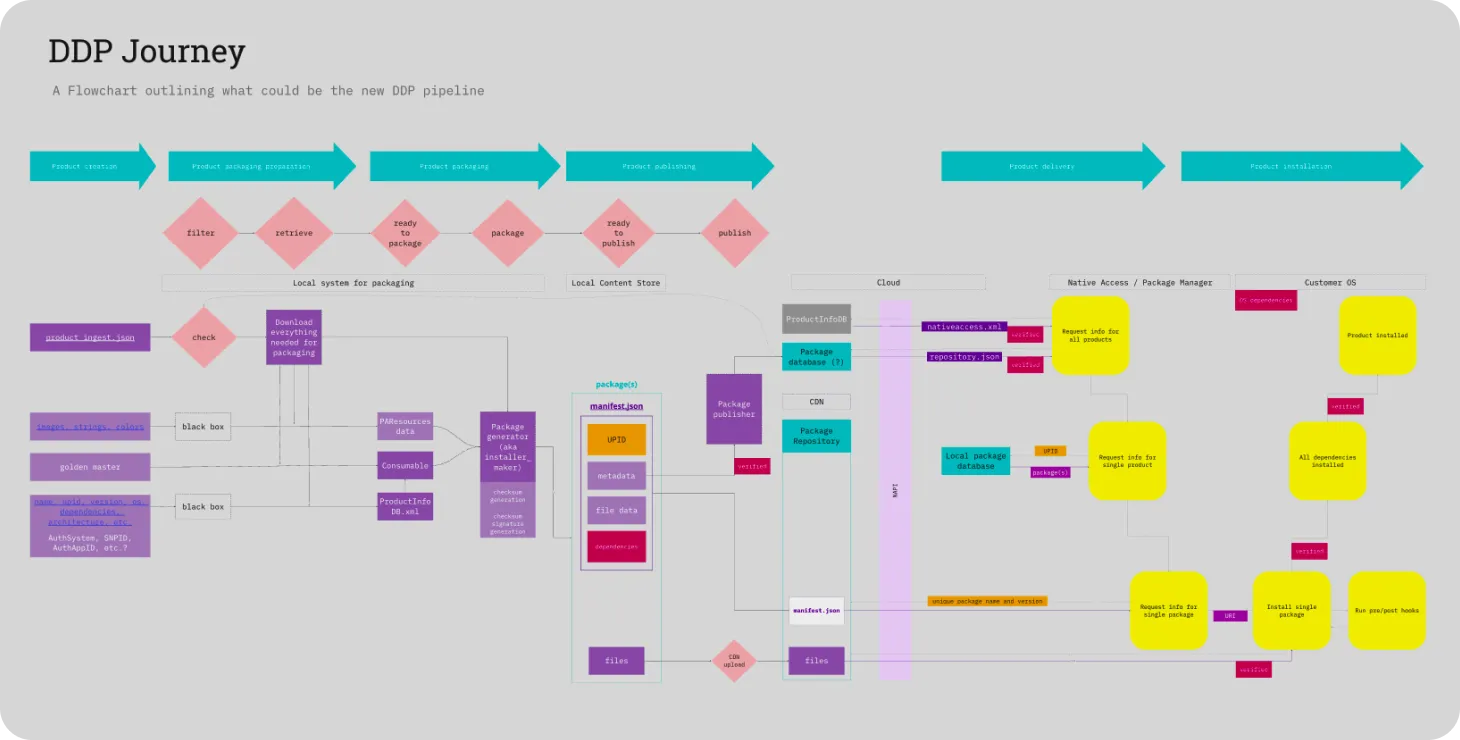
The project started with the migration of our Content Delivery Network and the refactoring of our installer’s tooling. Communication between three development teams was not efficient and begged a single source of truth. I built an entity map which all people from Product could comprehend and reference.
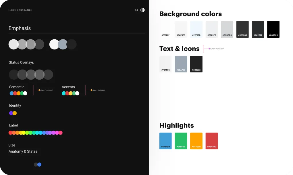
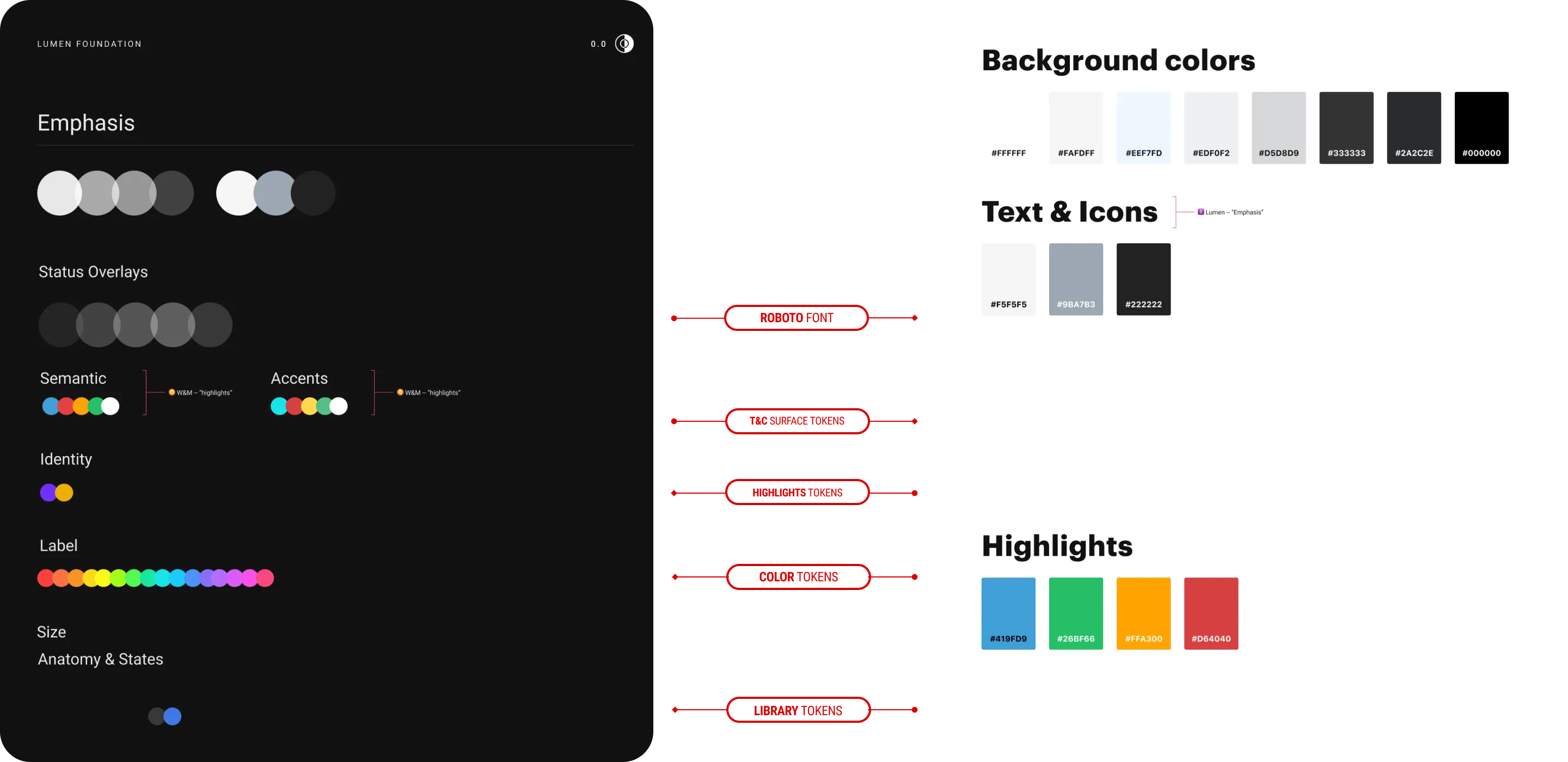
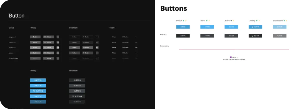
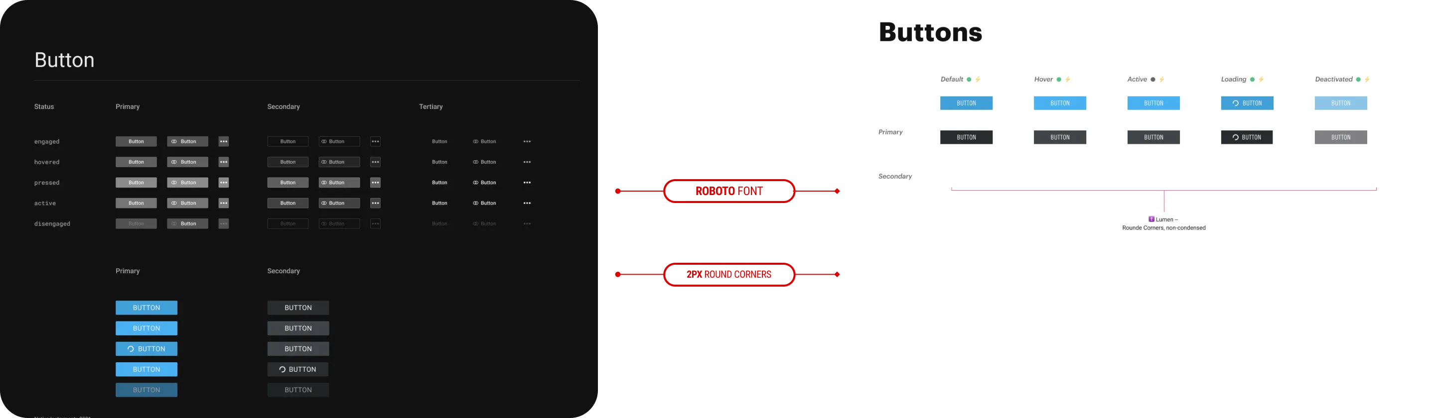
There was much debate over whether Native Access was part of the web experience or product experience. I was one of three designers who built the design system we implemented for Native Access. Lumen, our product design system, won out given it was more modern, more versatile, offered more components and was better documented.
Nearly a year into development of Native Access there was a top-down company-wide decision to roll out a
subscription model. We were already falling behind on our ambitious roadmap.
We delivered a 5000 user beta of subscription through Native Access, coordinating across twelve
inter-disciplinary teams.
I fixed a gap in communication between teams. Company-wide the subscription project was becoming out of sync.
Redundant meetings and wasted work ensued.
I solved this by creating a board showcasing the latest userflows across all touchpoints including lanes where each team kept updated notes on what they’re building and how.
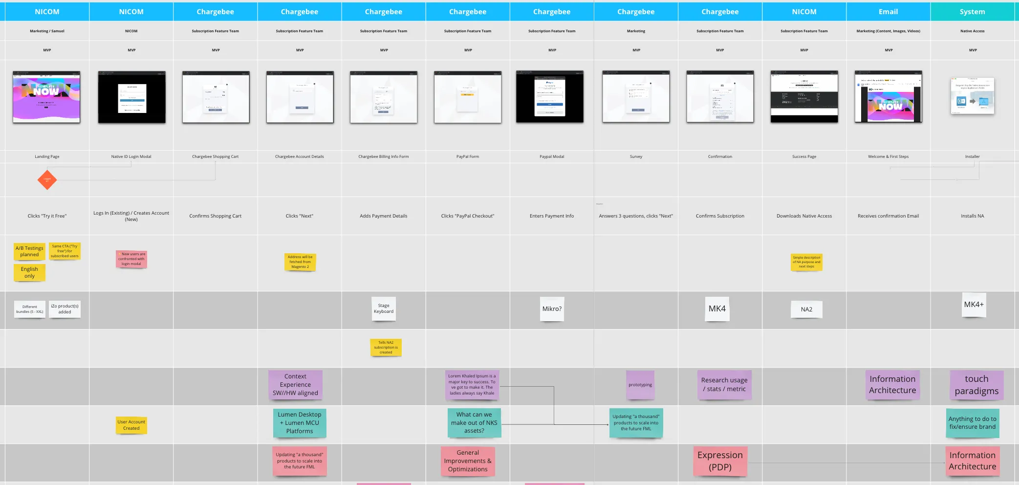
With clear pain points and stakeholder requirements, it was easy to mock an MVP for the developers to start building. Meanwhile the Alpha Group and I continued to explore features and refine solutions. And finally, I put on my Design System hat and began culling Components and Patterns we’d need to add to Lumen.

With clear pain points and stakeholder requirements, it was easy to mock an MVP for the developers to start building. Meanwhile the Alpha Group and I continued to explore features and refine solutions. And finally, I put on my Design System hat and began culling Components and Patterns we’d need to add to Lumen.
Alpha + Beta Community I kicked off an alpha group of 12 power-users to help find corner cases and refine the UX allowing me to design with confidence.
This granted me more time to focus on design concepts, prototypes, writing spec and designing for less experienced users. The group was organized and passionate. We received critical and enthusiastic feedback daily.
Being my first time working with a web framework I was quick to suggest embedding an in-app feedback tool during late beta. We implemented Appzi and switched to Typeform upon release. In-app feedback lives in the app to this day acting as the primary touchpoint of user feedback. Many other teams at the company have now adopted this approach.
Solutions to the major pain points were tested and validated during user interviews. We then refined upon our solutions, circling back to the same users.
My specifications, design components, and the app itself...
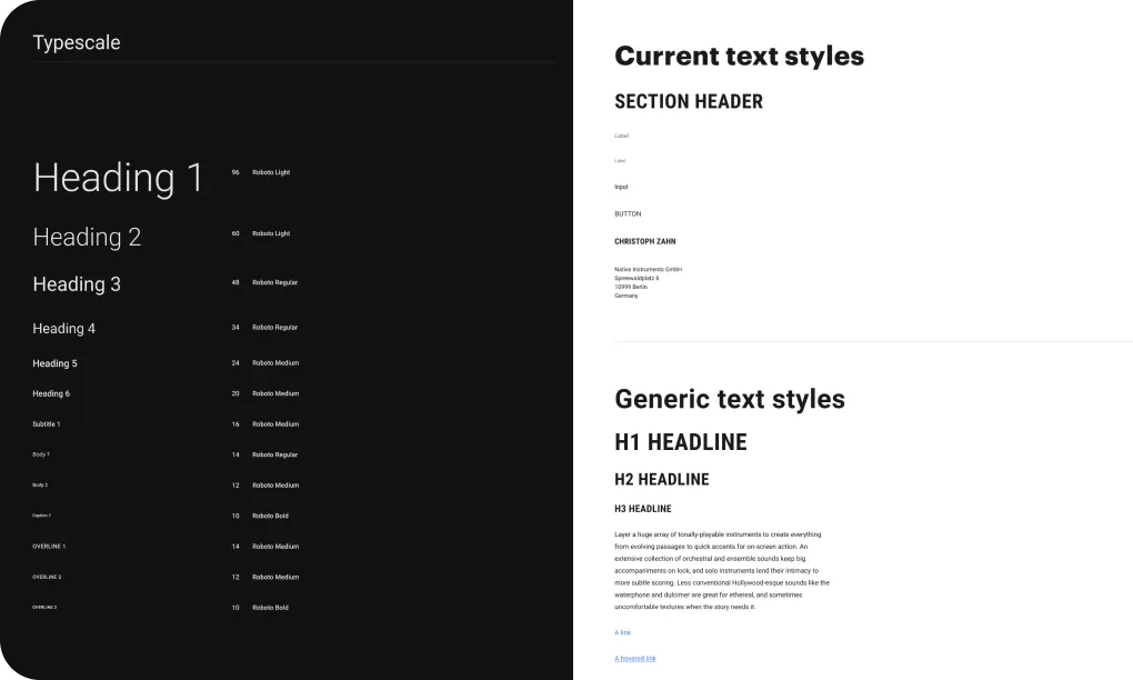
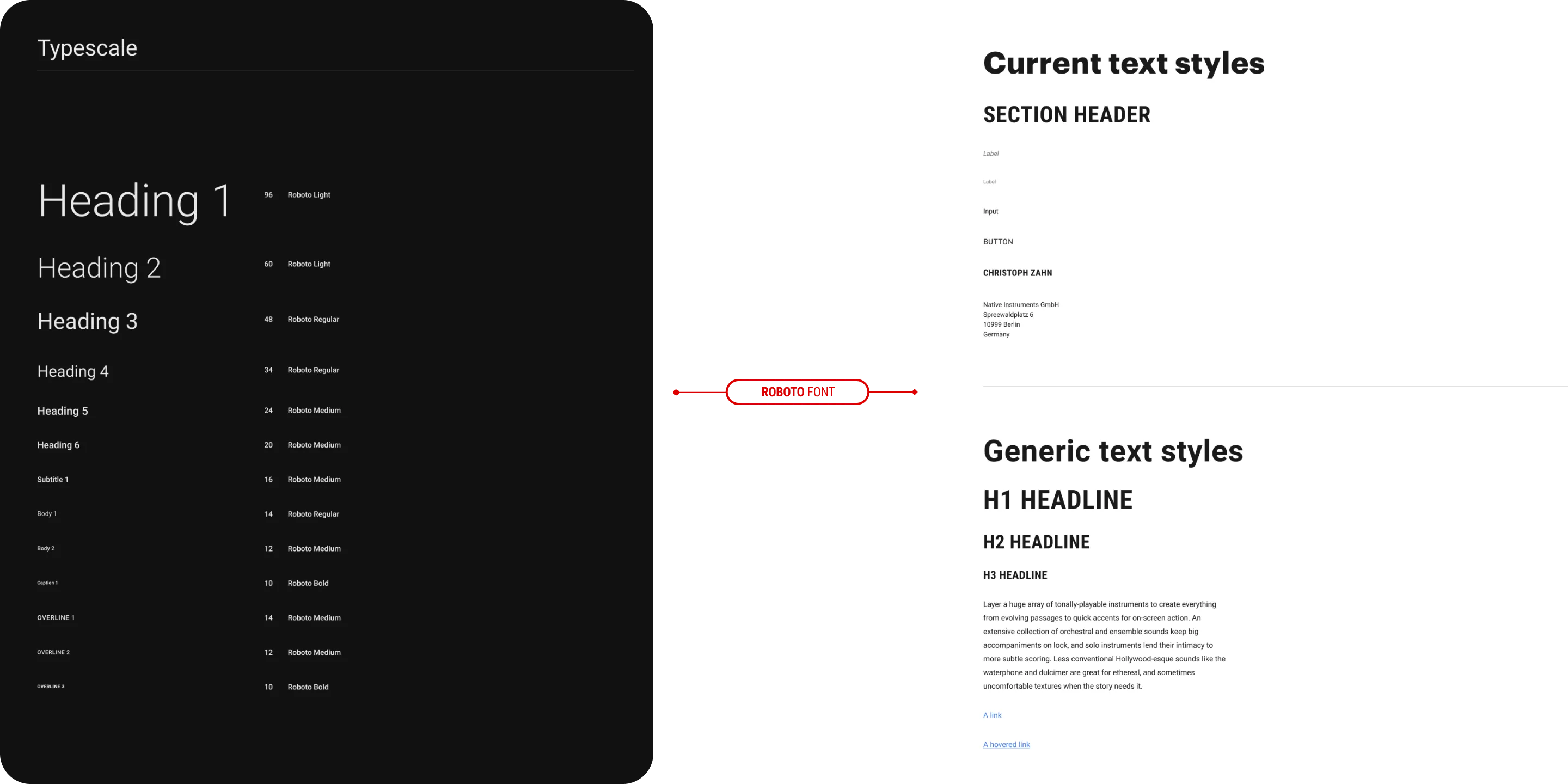
Design Tokens make up Components; Components make up Modules; and Modules make up Patterns. Find the Native Access 2 UI Patterns on Figma, here.
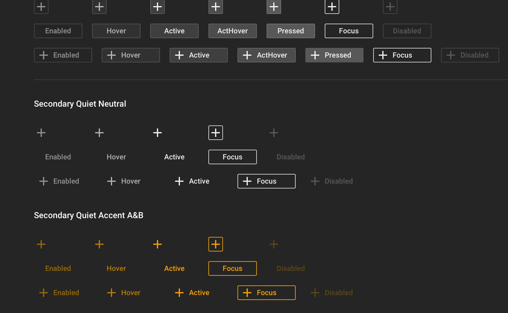
The design system I co-created and expanded to build this product.

A close look at what the competition was doing in order to ensure a clean funnel from Engagement through Purchase.
Try the application yourself!
Username flashblock.ni@gmail.com
Password Flashblock2020
Sit back and enjoy a full video tour of the application and it’s features.
I invite you to look at select Figma artifacts...
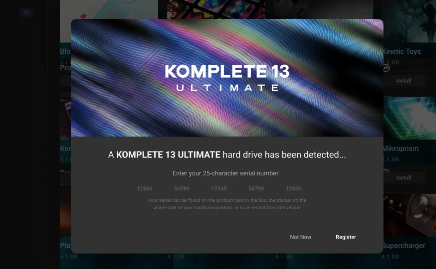
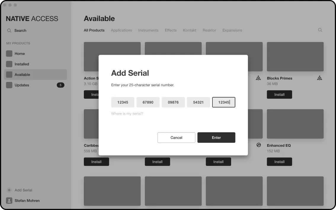
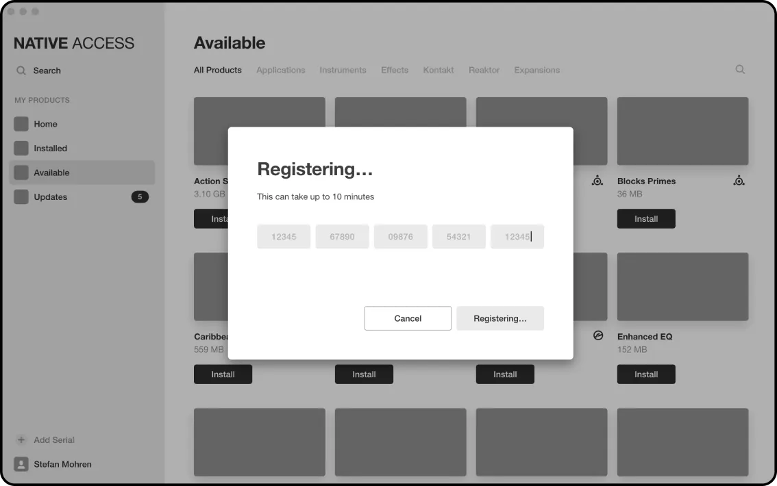
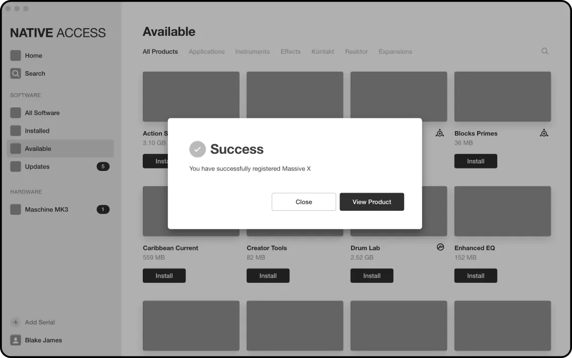
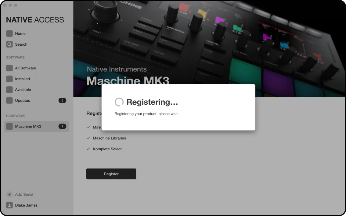
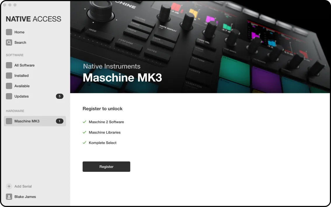
HDD detection, registration and installation success.
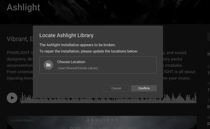
Broken installation, (re)locating installers.
Audio Preview concept.
Keyboard navigation for VoiceOver prototypes.
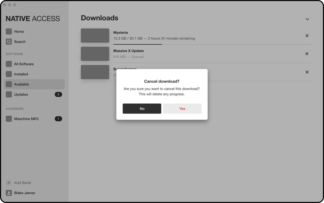
Queuing, Pausing and re-sorting Download items.
Quick and easy steps for onboarding users concept.
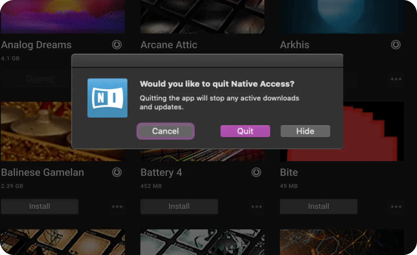
One doesn't simply 'quit' a download agent running background tasks...
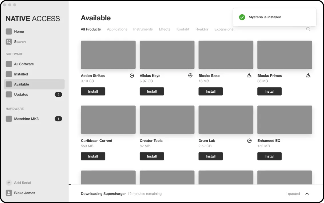
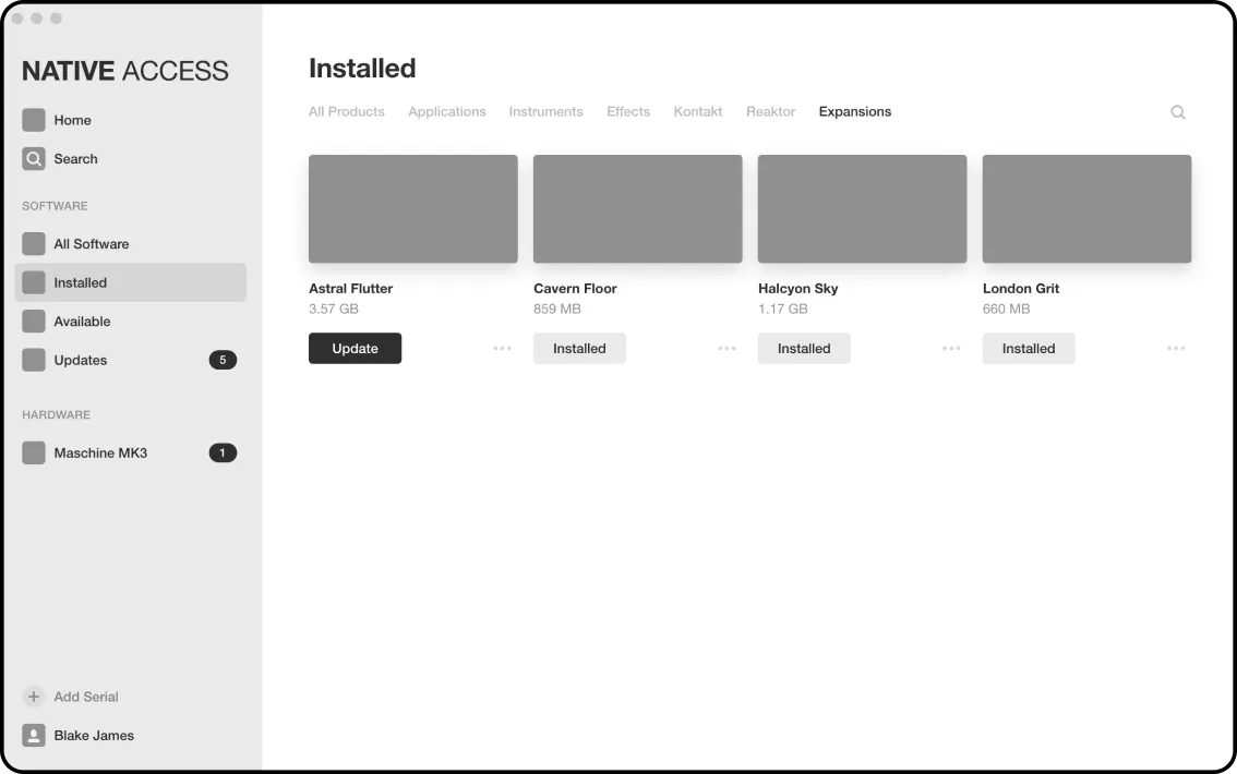
Easily sort through your newly installed products.
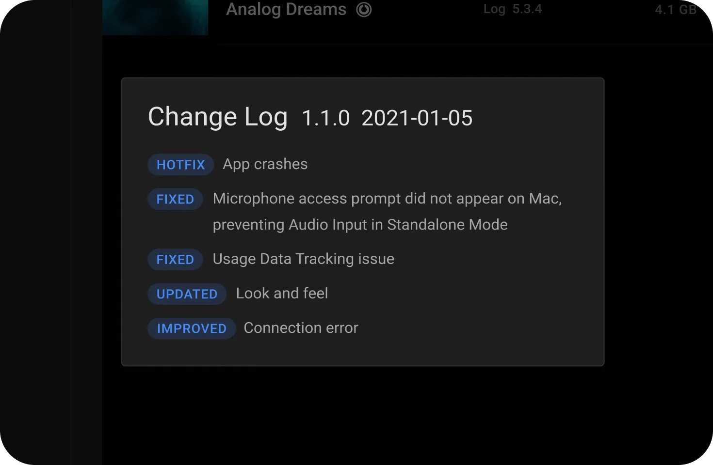
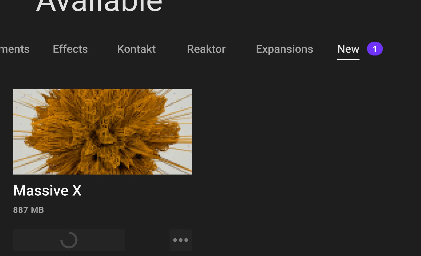
Find the latest deployed updates, the release notes, and install.
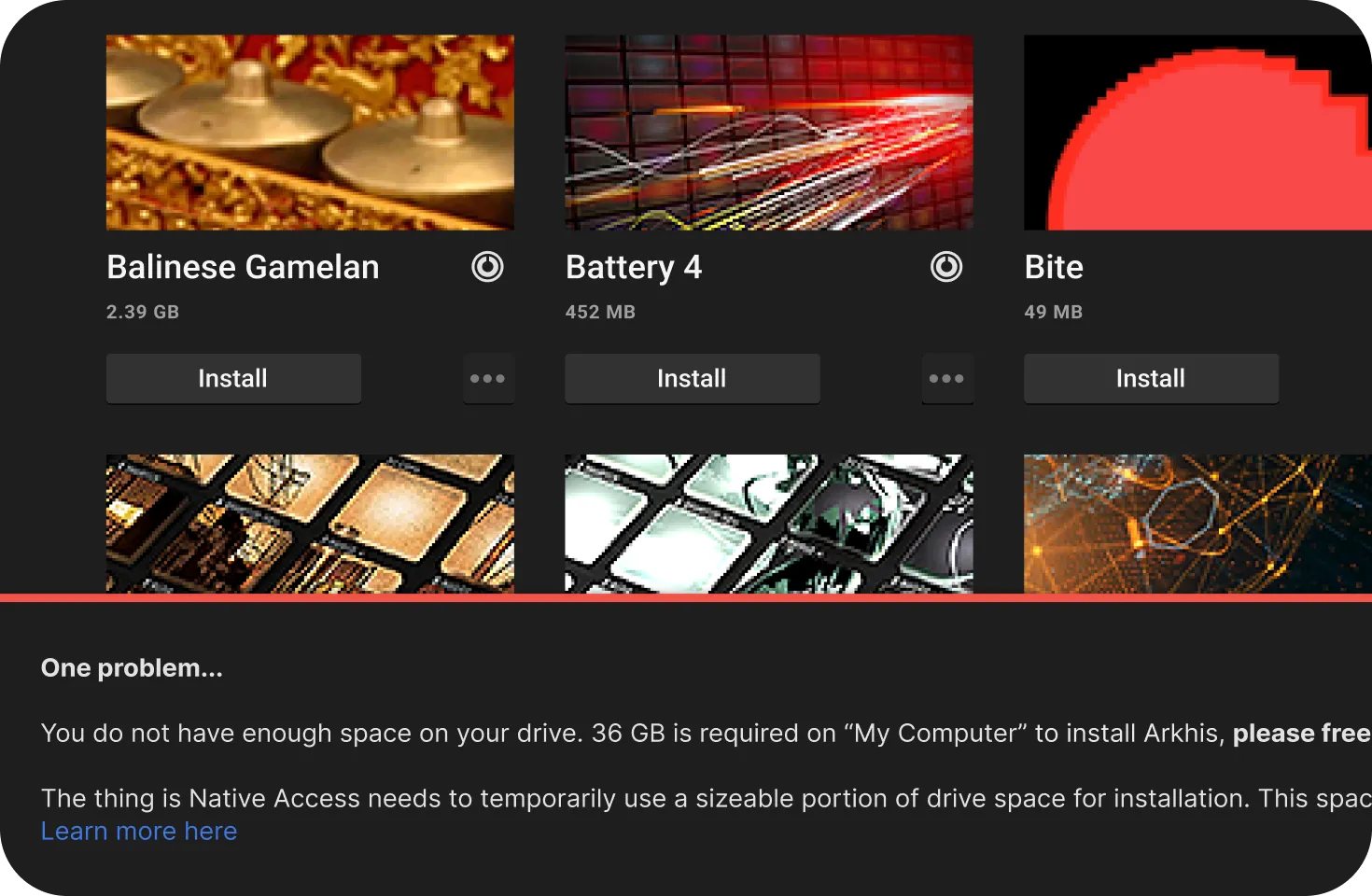
With the potential of harboring over 2 Terabytes of products on your harddrive, the usecase for 'not enough disk space' is critical.
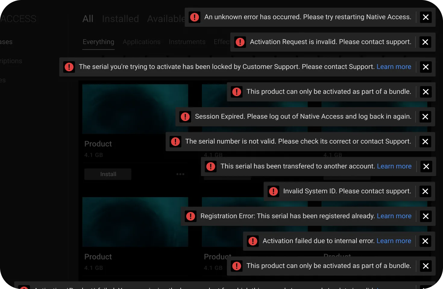
Toast notification to help users understand what’s going wrong